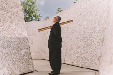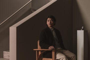
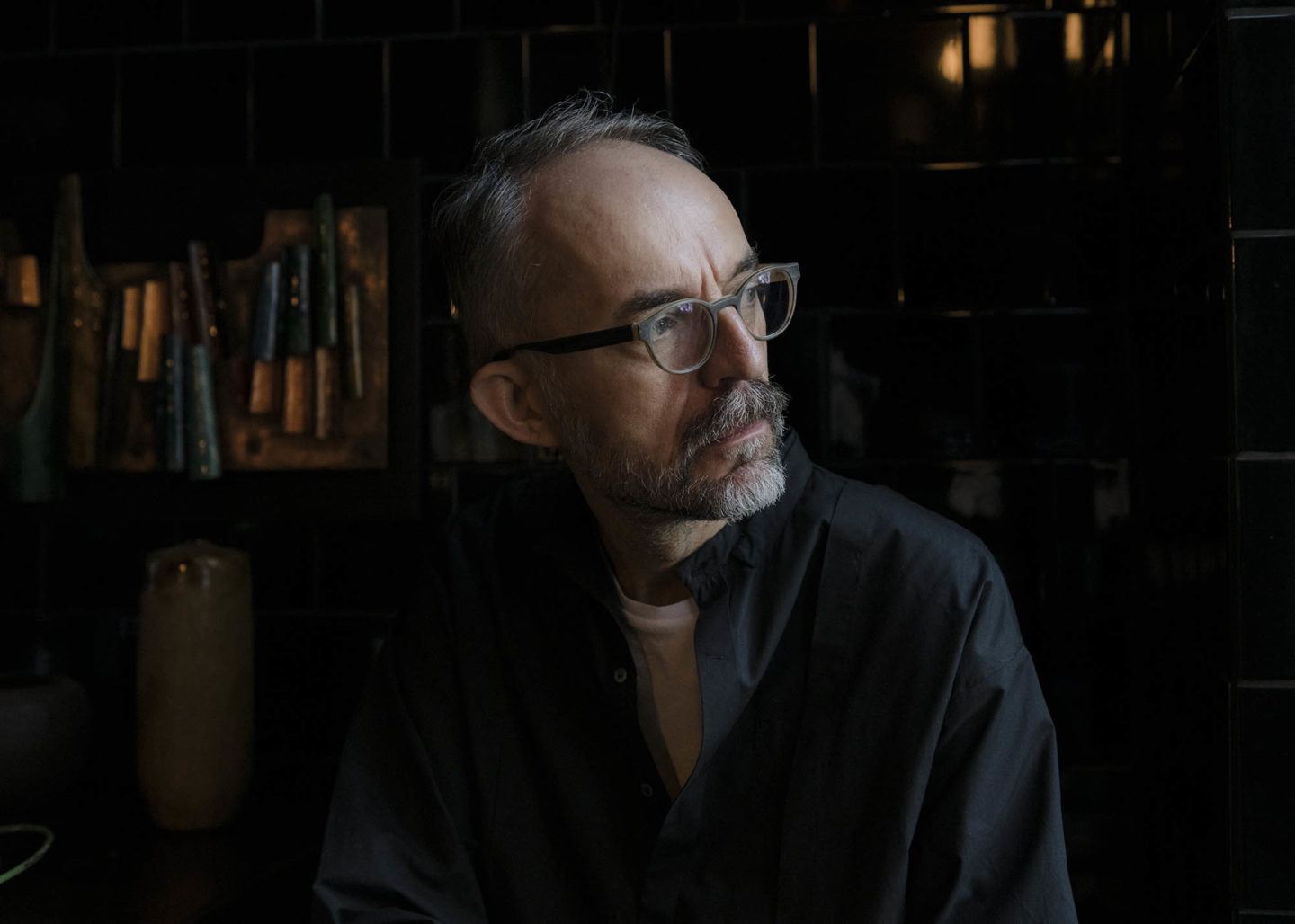
Setting The Scene With Sylvester Koziolek
- Name
- Sylvester Koziolek
- Images
- Franz Grünewald
- Words
- Anna Dorothea Ker
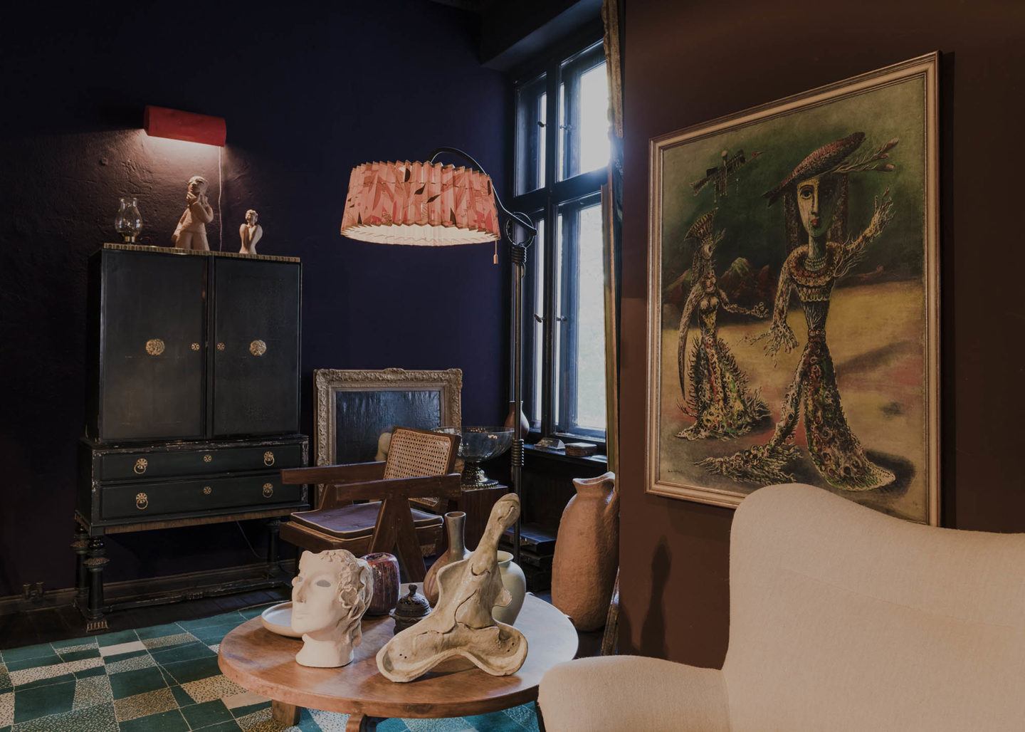
Designer, art director and scenographer Sylvester Koziolek counts many strings to his artistic bow—one that’s saturated in rich and evocative tones. In his curation, staging and presentation work across a diverse range of scenarios—from film sets to fashion boutiques and private apartment interiors—two common elements of his signature style recur: a refined color palette, and a well-chosen frame.
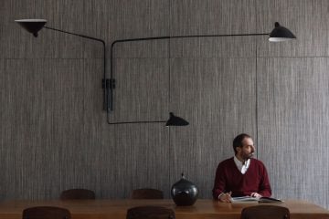
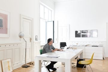
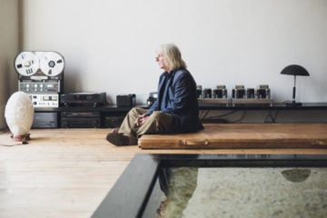
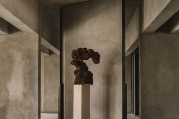
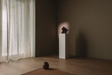
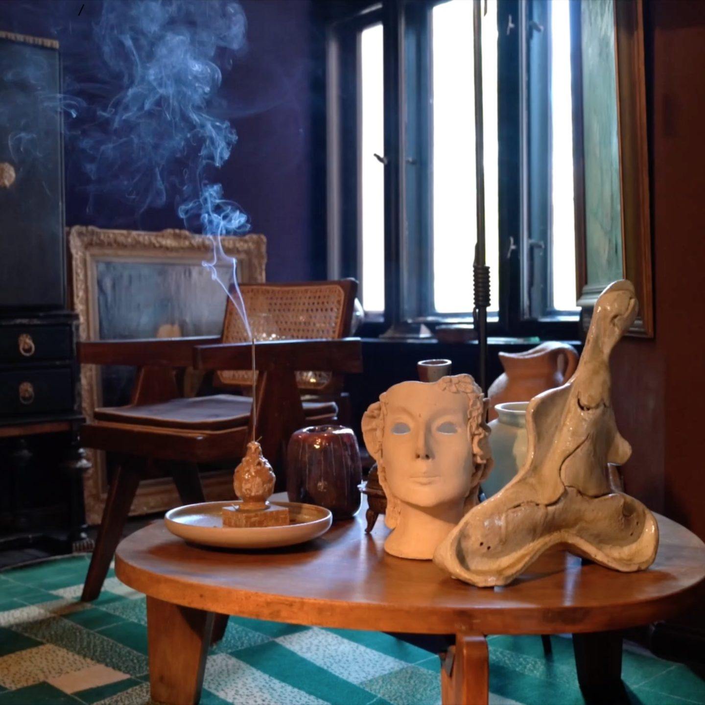
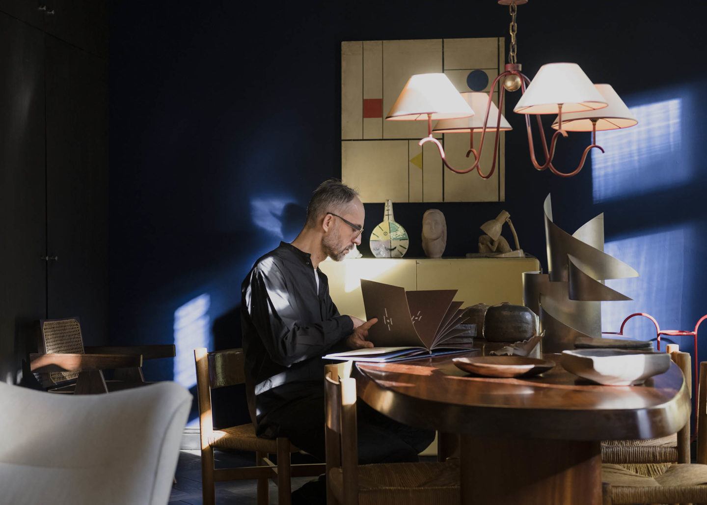
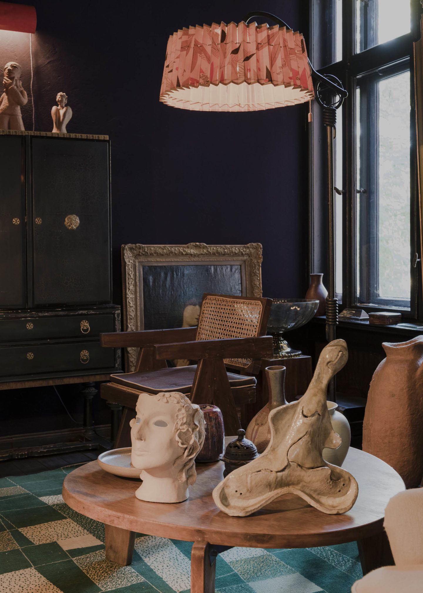
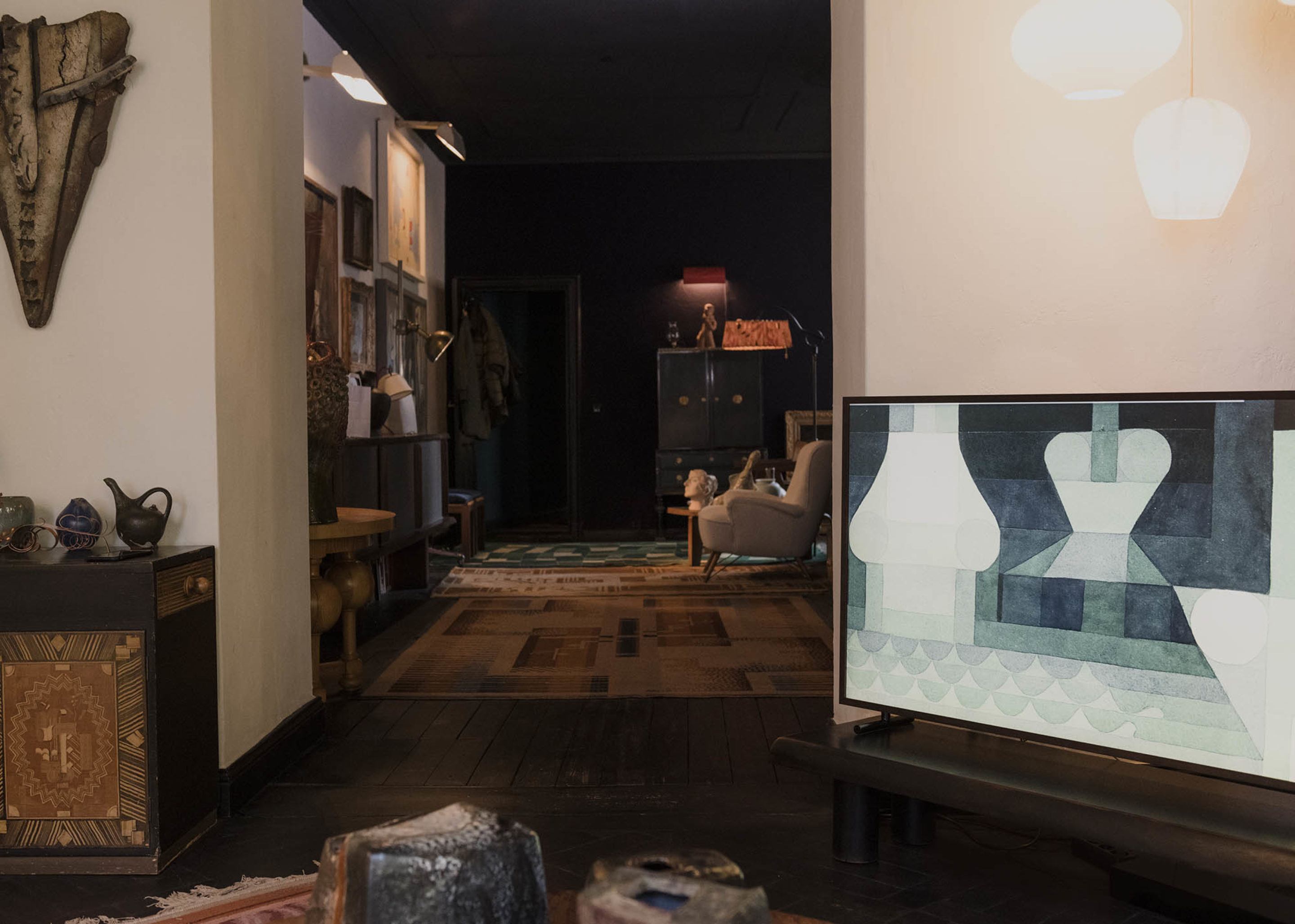
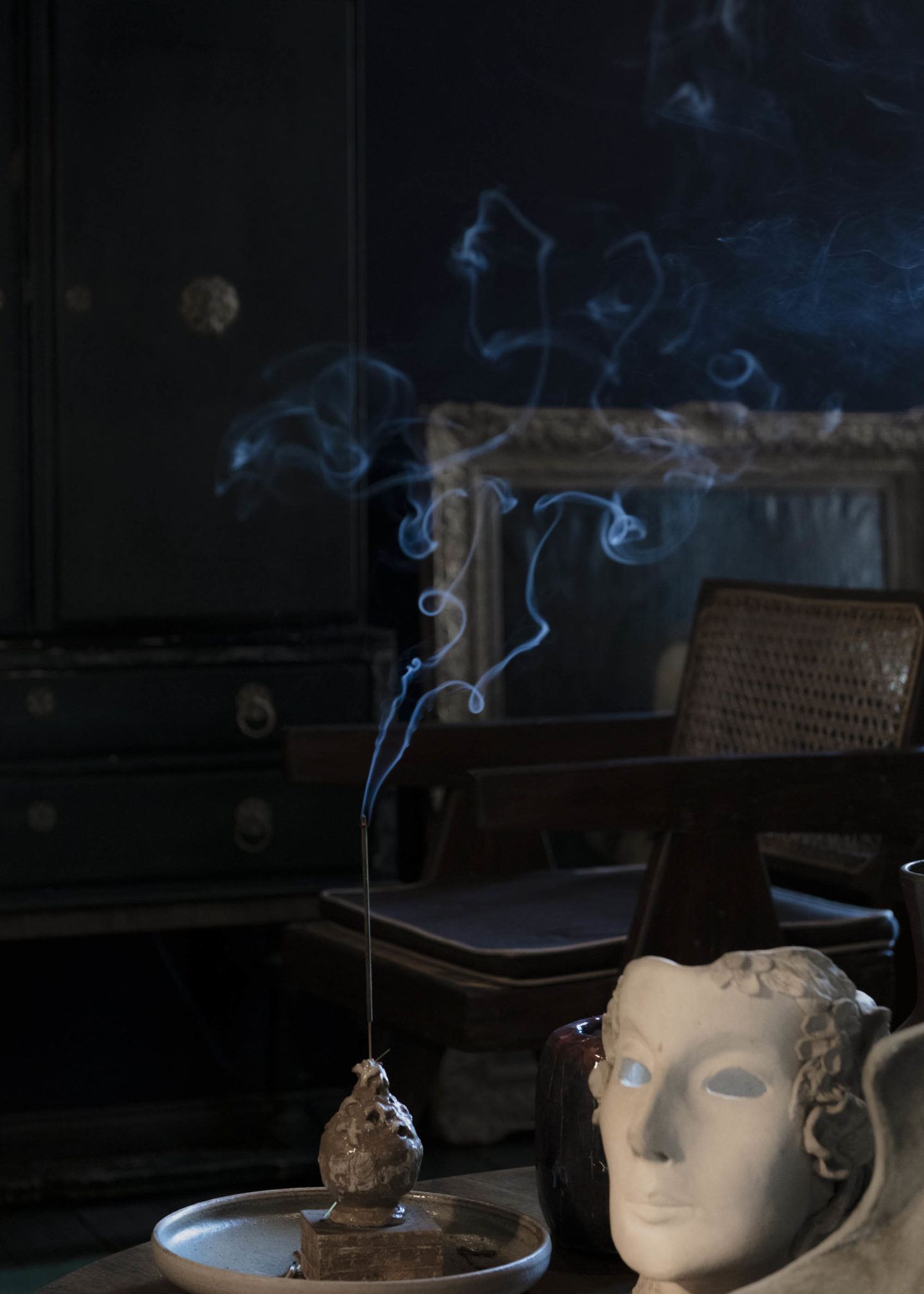
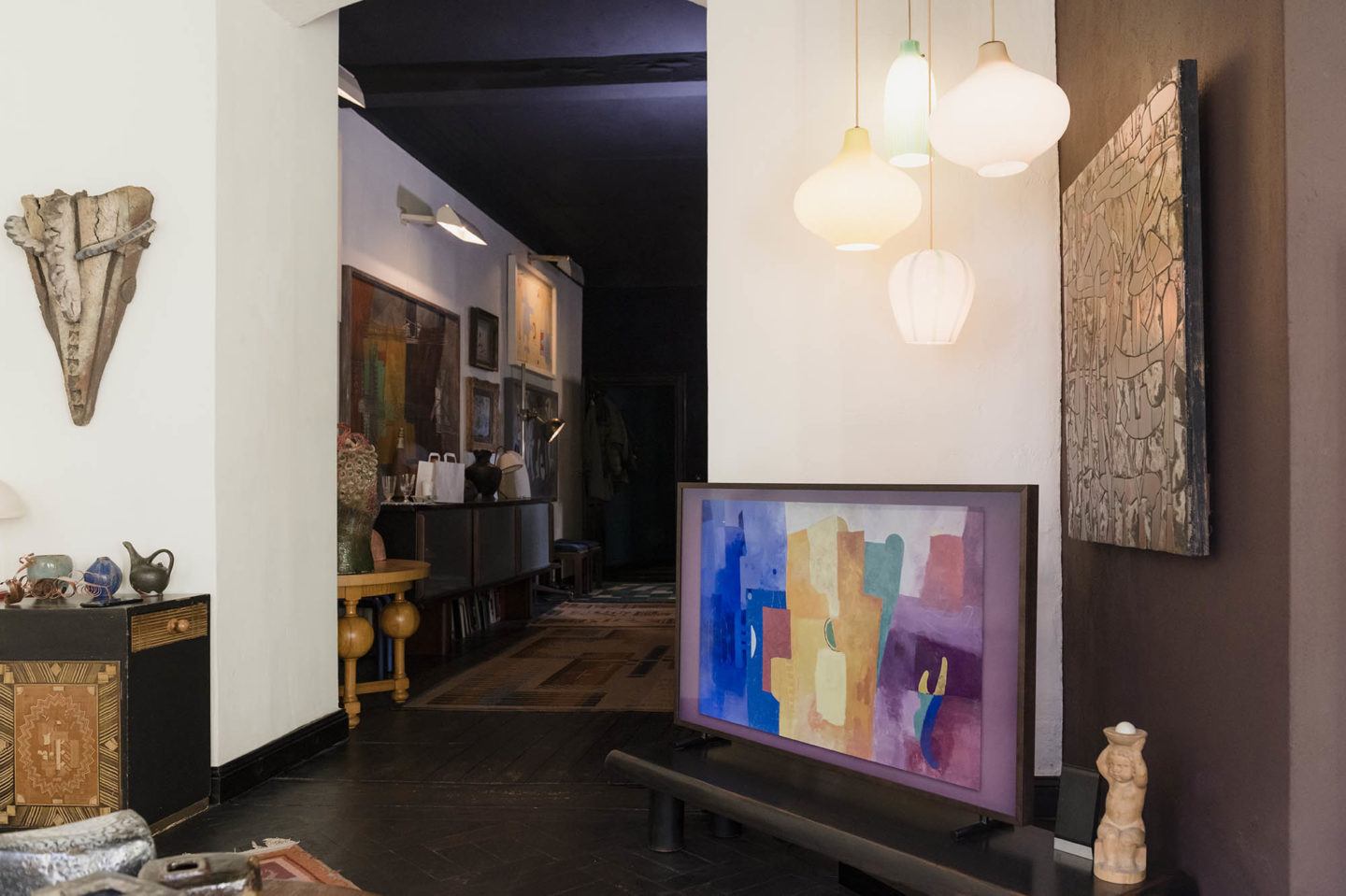
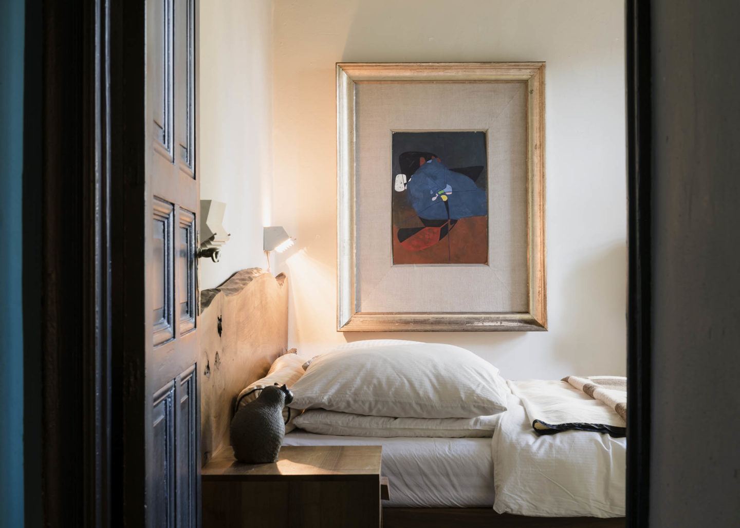
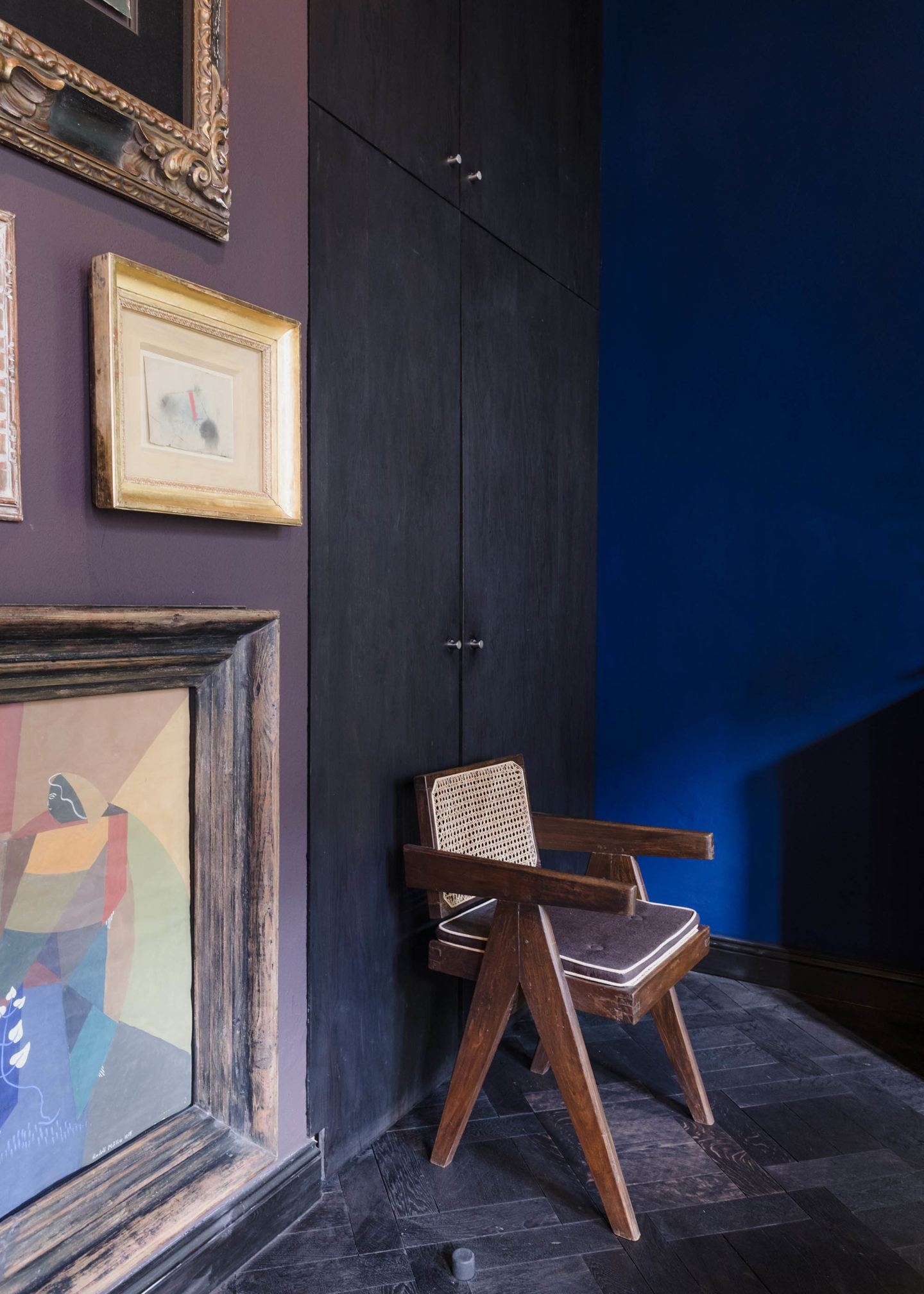
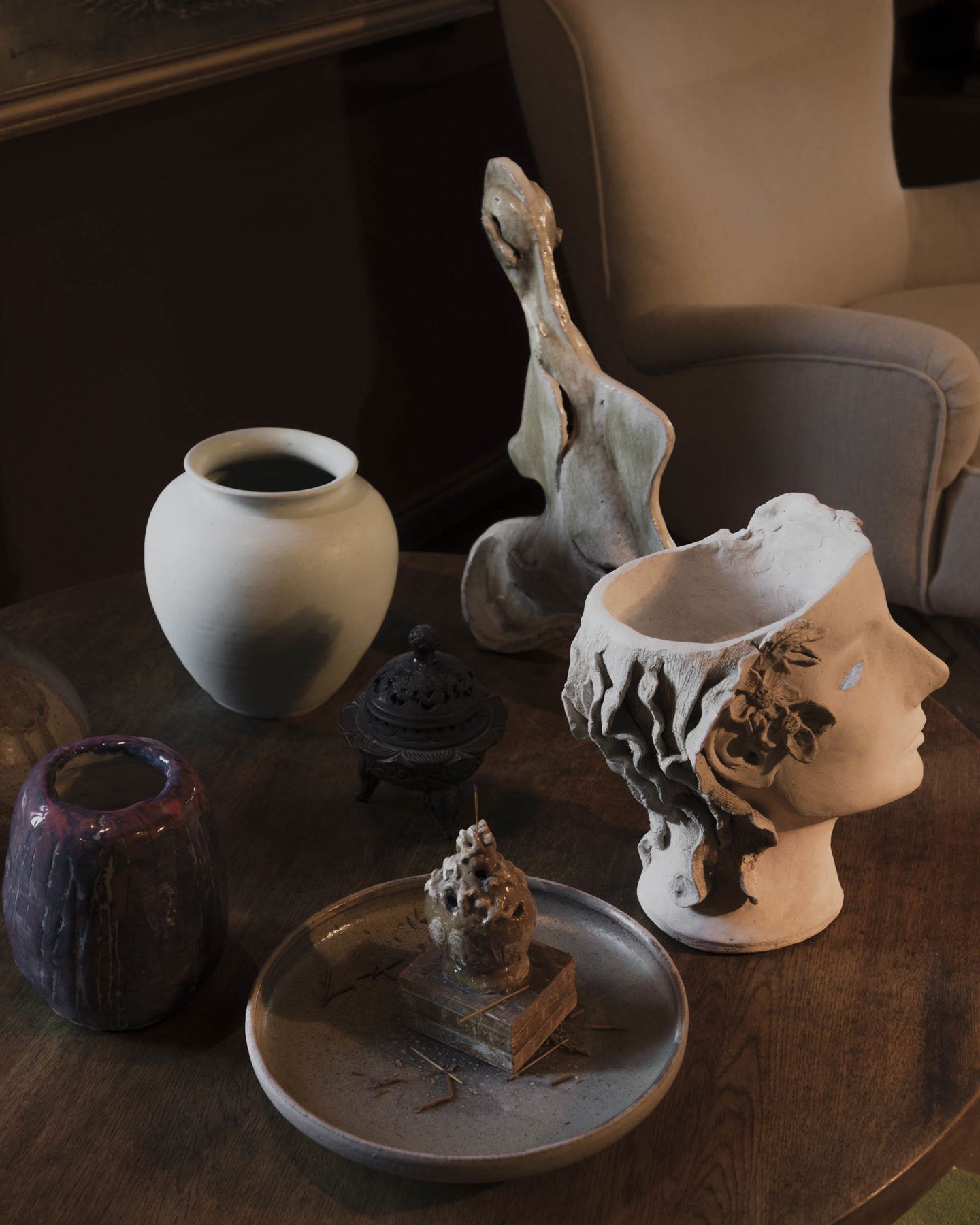
These are equally present in Koziolek’s sumptuous apartment in Berlin-Mitte—the latest addition to which is the new Samsung TV, The Frame. With its fine walnut frame, the television—currently on Art Mode, which allows for the display of the Samsung Collection of artworks—blends in seamlessly against the dark walls, upon which twentieth-century paintings by German masters in lavish frames hang. All around, thoughtfully-selected antiques are placed in considered compositions with French mid-century furniture pieces, lights and objects by the likes of Royère, Perriand and Matégot. The overall mood is grand, dramatic and eclectic—the ideal tone in which to lead a lively and frank conversation with Koziolek about his approach to collecting, his love for classical modernism, and the secret to a harmonious arrangement.
I hear you’re a night owl. Does that have anything to do with your decision to choose dark tones as the backdrop to your apartment?
The dark tones linger on from an earlier era of my life, when I focussed on creating interior spaces. Today I’m still a night owl, but over the years I’ve lightened things up a little. The whole place used to be totally black. Now the older I get, the further I’m moving away from that [laughs].
Is it fair to say, then, that the evolution of your aesthetic interest is reflected in how the apartment has changed over the years?
So the [original] choice of black came as I was working as a set and stage designer, and the backdrop of theaters is, of course, always black. The same goes when you’re working on film sets or in studios. The only thing that isn’t is what’s being filmed. I’ve always found wooden flooring horrible because you can’t place anything made from wood on it. So together with a fellow student of mine—this was in the 1990s—we did the whole apartment in black. Eventually, it took on a life of its own, and all of a sudden you could place—and see—light really well, and also introduce wooden elements. Color also worked totally differently.
"I don’t need to be as pared back as I used to be when I was young."
And how does the way it is now reflect your current aesthetic direction?
I don’t need to be as pared back as I used to be when I was young. I’m not really interested in that anymore. I don’t have to commit to following one particular style, as I did when I first moved in to my apartment and chose black as the main setting—at that stage, I was focussing more on scenography. There’s no singular direction this space has to develop in. Instead, it embodies whatever I’m currently in the mood for—what makes me feel good, and feel well. There are still traces of darkness throughout though—maybe I can’t totally relinquish that element of myself [laughs]. But it has to feel natural to me. Now it’s more about color and about contrast.
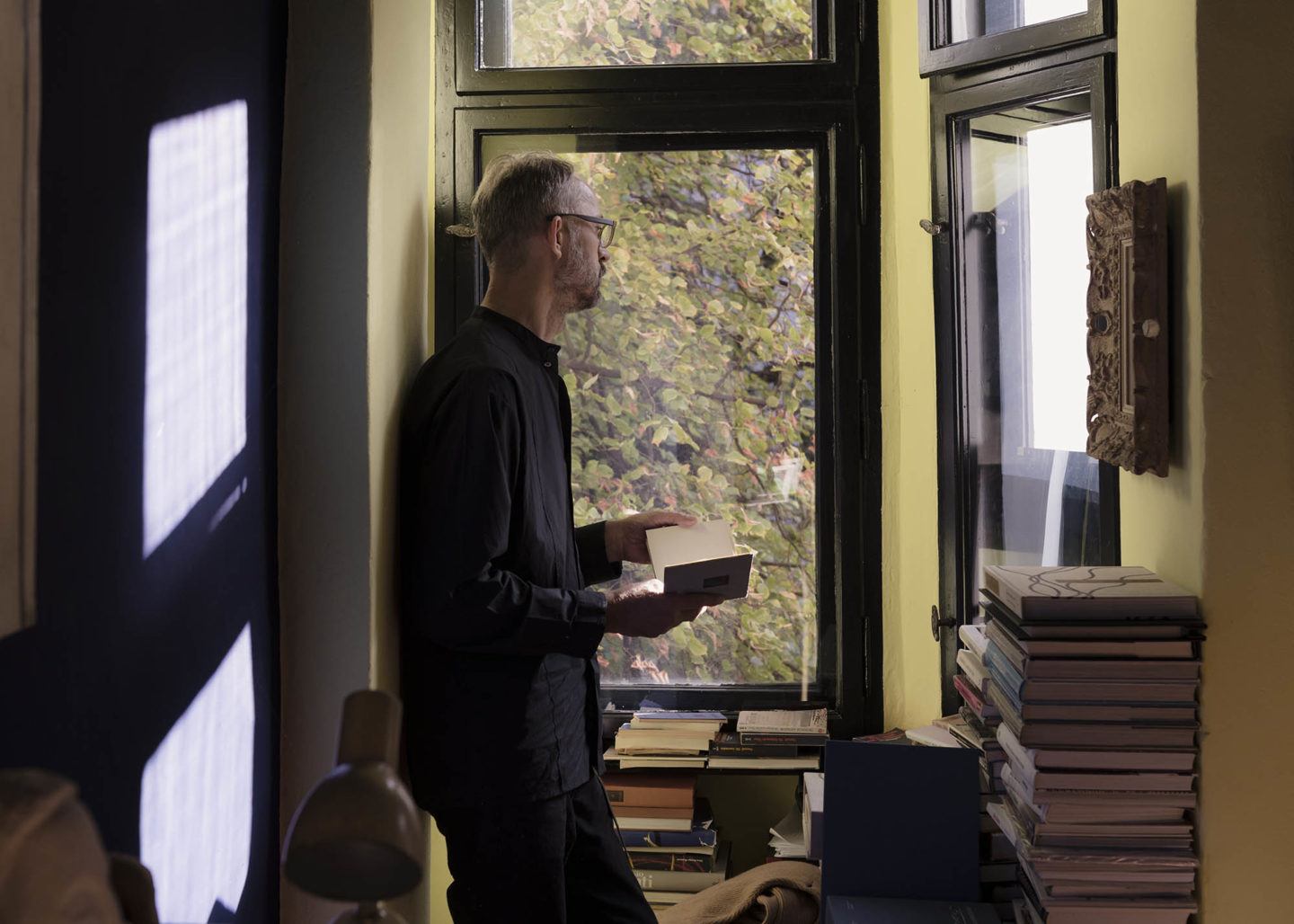
I’d like to hear about your approach to collecting. What are some of your favorite sources for finding artworks and objects?
Mostly international auctions. Though it makes sense to look for objects in the places they were produced. At the moment I’m not collecting so much furniture anymore, but rather German post-war artworks. Classical modernists. I like to dig around for rare works that no-one’s seen before.
Combining different styles and epochs is one of the major lifestyle trends for 2018. You can discover more ideas for interior design and TV integration in the Samsung Entdecken blog.
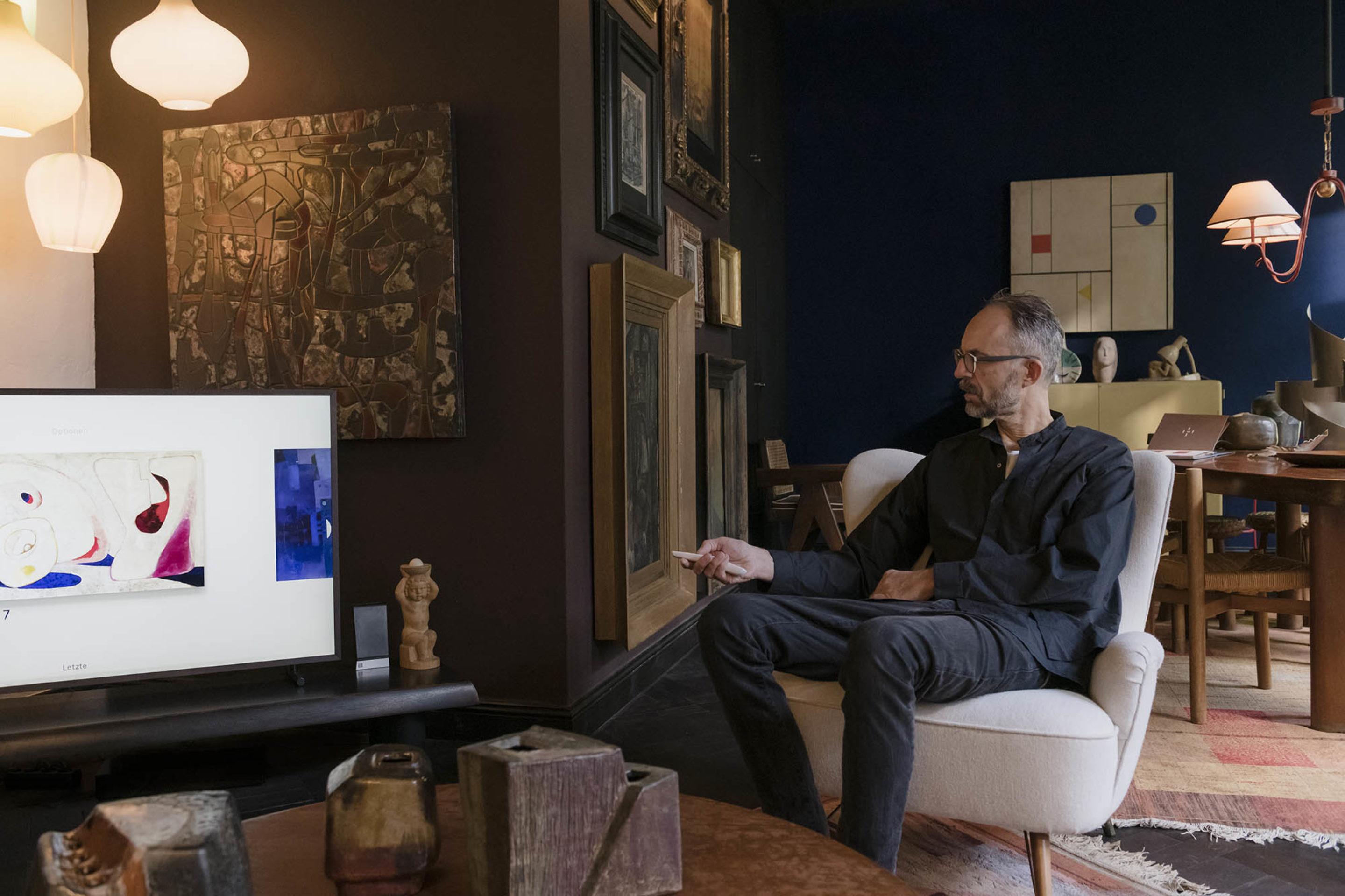
In light of The Frame, I’m interested in the idea of “art on demand”. What’s your stance on how technology has changed the way we experience art?
When I studied art, I thought what I created needed to be totally modern, though I rarely succeeded at incorporating them in my creative pool of ideas myself. I think that new forms of media are important— here, with the Samsung TV The Frame, all you need is the frame and the artworks provided by the television, and all of a sudden the art works within the space. I like that the choice of the passepartout frame, and the color options, allow you to present different works the way you wish. I, for example, chose the wooden frame to complement the walls.
On the topic of bringing different artistic eras together, Samsung’s The Frame brings together a diverse range of artworks. What kind of dialogue do you hope for the TV to have with the rest of the room?
It’s great to see that this collection has been produced and is made available digitally—that these works of art are presented on this thin frame. Their presentation works in a similar way to film—you let yourself be consumed by it. It’s only one dimensional, but it has a powerful effect. And it’s accessible to bring art into your home, and to have fun with it. To always be able to change the gallery, to present the artworks whichever way you want.
How important is frame and the presentation of the work to its value to viewers?
Very. Modern frames are often a lot more pared back. I like it when the frame and the work have equal weight. When I had to decide which color frame to choose, I enjoyed observing the effect that it had on different works in the gallery. It was also very important to me to select a color that fit with the walls. A poorly-made color choice is immediately apparent.
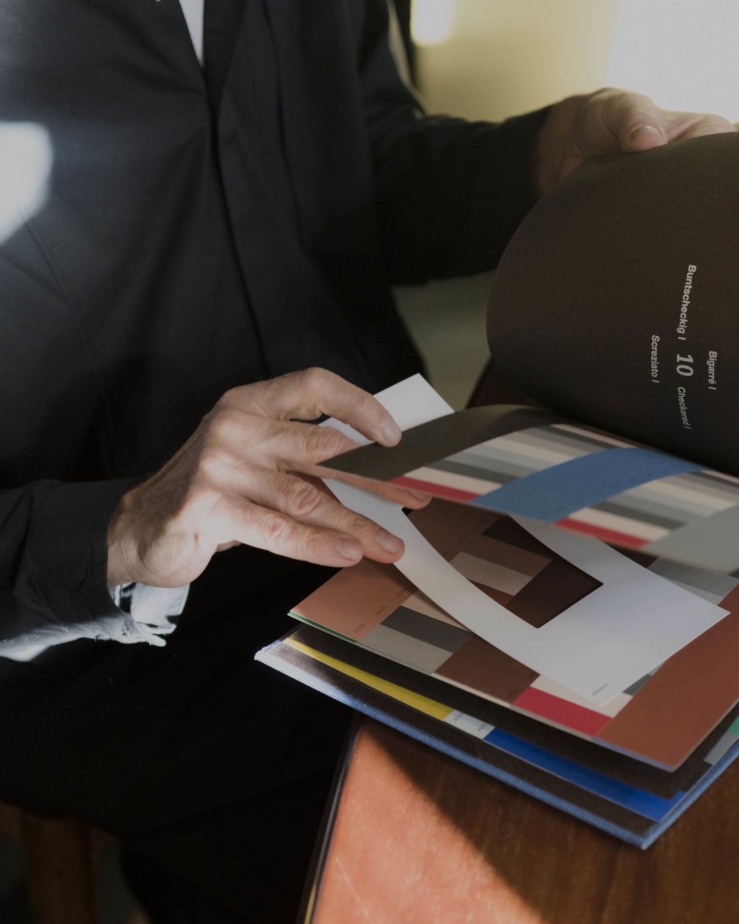
What’s your process for deciding which colors work together to achieve a certain effect? Is it a formula, or a feeling?
Color combinations are a lot more complicated than one might think. When I design room interiors from a color perspective, I need to make around three to four changes. The more you add, the more complicated it becomes. The last step—adding the final flourish in exactly the right way—is always the most challenging part. It’s the same for furniture, too—and painting. It should be the other way round, actually, but unfortunately, that’s not possible. It’s especially difficult when everything’s already there and there’s perhaps only one piece missing. Then, of course, what I’m already working with will dictate the rest of the process. Like an antique armchair—it will all depend on what I find, and whether it needs reupholstering. Ultimately it’s the antique pieces that determine what will end up being placed next to them. Everything else needs to be adapted around them.
"When I studied art, I didn’t necessarily have the conviction that I was doing the right thing. I had so many different ideas."
Your work encompasses art direction and design for both still and moving image. How does your approach to each inform the other?
Well, everything I do is a question of concept and artistic direction. There are similarities across the board—costume, images, art direction and scenography for film and advertising. Ultimately it’s all a question of taste, which of course depends on the eye of the beholder, and changes over time too. When I studied art, I didn’t necessarily have the conviction that I was doing the right thing. I had so many different ideas. My taste took a while to develop.
So, how did you develop your tastes and gain confidence in your artistic position?
Well, when it comes to client projects, it’s not only about what I prefer. I like it when the client has a bit of taste too. Then I’m challenged a bit. Because if I’m left to my own devices to decide everything, it’s not necessarily perfect. Sometimes I take a step back from my preferences and decisions and reevaluate them. It’s important to stay critical.
A bit of friction can help further the creative process.
Exactly. Every now and then, I work on small-scale projects for actors, and have to decide on furniture or interiors, and I prefer it when they share their input too. I’m anything but vain.
Can you share a project that was challenging, but ultimately led to a good result?
I did the interiors for the heritage-listed Arne Jacobsen houses at Hansaplatz [in West Berlin] for the gallerist Nina Pohl. Christof Piaskowski was responsible for restoring, and modernizing the two original houses, and I was in charge of the furnishing, lighting and color schemes. That was an interesting challenge, to work with an architect who isn’t focussed on furniture and objects. The rooms had been rebuilt, but they weren’t finished by the architects—with fixtures and antiques and so on—because Nina didn’t want strict architectural imperatives to dominate the space. The collaboration between myself as a designer and Christof Piaskowski as the architect was interesting, as it highlighted the difference in our roles in the creation of a space. I would never trust myself to bring to life something completely new. I can implement and adapt ideas from my mental creative pool according to certain needs, but I’m not here to suddenly produce a new chair from scratch. I can, and I have, but others do it better. I’m the person who brings things together, who administrates. I think the project was also interesting for Christof Piaskowski—to have someone come in later and complete what he started, to be surprised by the interior concept I created.
_
This feature is part of an ongoing collaboration between Samsung TV and IGNANT. Read part one with VAUST Studio here and part two with Jonas Bjerre-Poulsen of Norm Architects here.
Interview by Anna Dorothea Ker | All images © Franz Grünewald for IGNANT Production | All videos © Nathan Ceddia for IGNANT Production