The Language Of Gris: Liz Michael On The Complex Beauty Of Monochrome
- Name
- GRIS
- Images
- Mikkel Mortensen
- Words
- Rosie Flanagan
Color is a complex perceptual phenomenon that is determined by the way that light waves interact with surfaces. It is an experience that is both scientific and emotional. It authors our perception; it informs our understanding of space and defines our relationship to it; it creates three dimensionality, evokes depth and stirs atmosphere.
Paris-based, London-born artist Liz Michael understands the expansive nature of color; its inherent contradictions as a science and an art, its luminosity and its darkness, and the power it holds to shape the world. She has encapsulated this complexity with Gris: a sustainable made-to-order mineral paint available in an exclusively monochromatic palette.
Gris is the French word for gray—an intermediate tone that sits at the centre of the color spectrum, a single color that contains multitudes. It is a fitting name for Michael’s paint project, which is simultaneously the culmination of a lifetime of work, and the continuation of it.
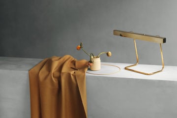
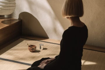
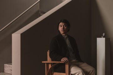
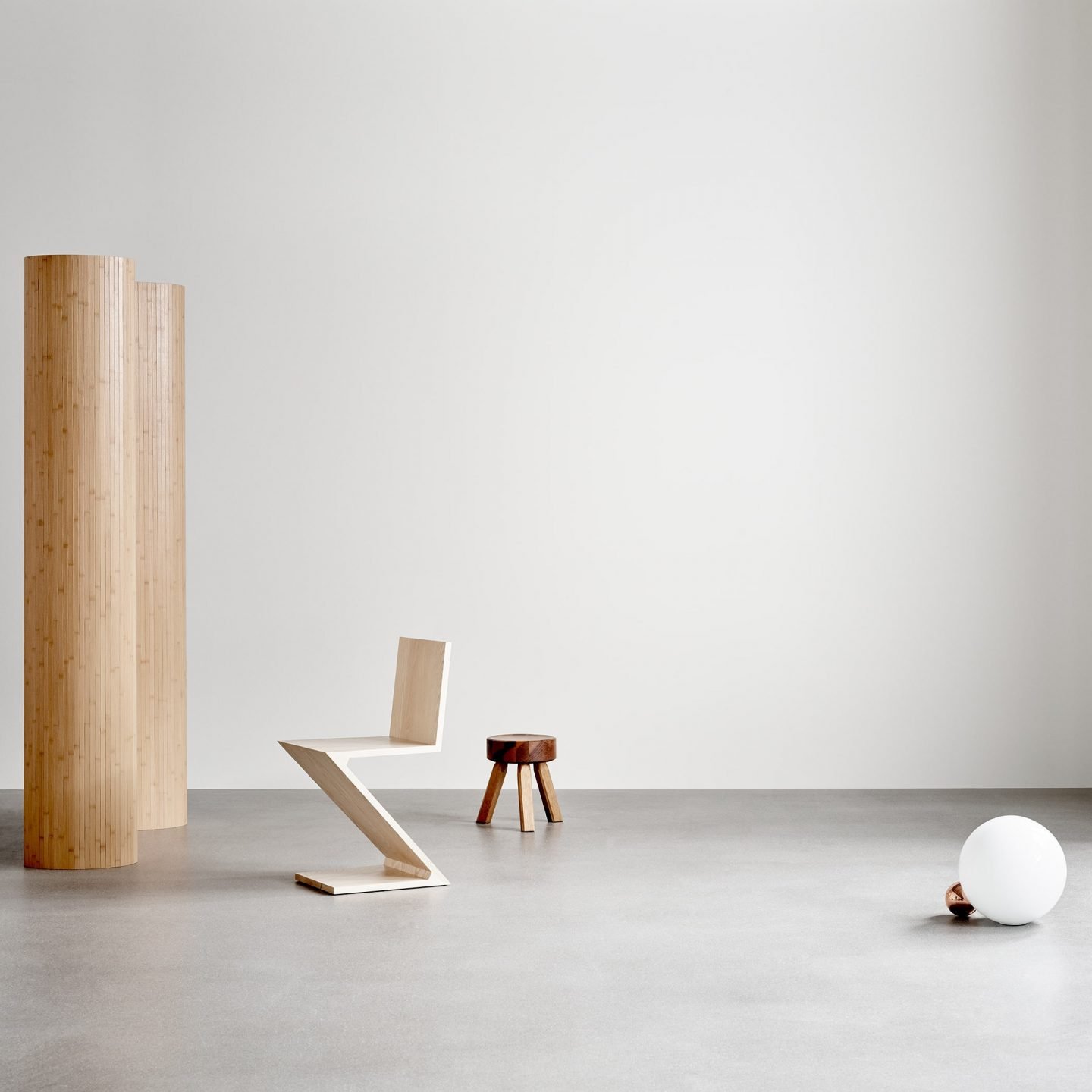
Image © Mikkel Mortensen
Michael has over 30 years of experience as a makeup artist; working in fashion, beauty, and film, a career that has seen her published in international editions of Vogue, Bazaar, Interview Magazine and The Face, while working alongside some of the world’s leading photographers. It has taken her from one design capital to another—London, New York and Paris—and has allowed her to hone her understanding of color, as it relates to staging, design, and photography.
“In a sense,” Michael explains, “I’m still involved in beauty, because I utilize all of those elements creating colors for environments which center around my love of design, architecture, and art. My aesthetic hasn’t really changed that much since the early days of my career. I always had a minimalist approach, even when it wasn’t fashionable to do so.”
'Gris' is Michael's culmination of a lifetime of work, and the continuation of it.
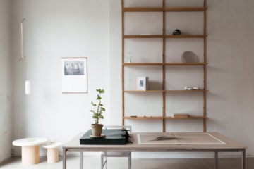
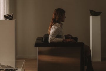
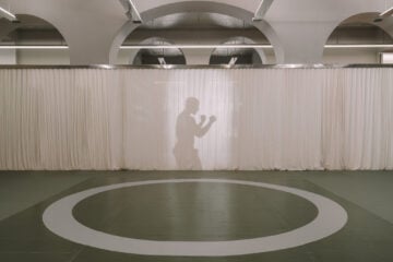
Image © Mikkel Mortensen
She describes her aesthetic as a minimalist approach to color: “The balance of creating something interesting, and maintaining the confidence to execute it as minimally as possible, still plays a very important part in what I do now with Gris; from the color palette, to the photography and the design pieces chosen for the pictures. Everything is carefully considered.”
This careful consideration, which Michael—with a hint of self-deprecation—calls “pickiness”, is what led her to paint. Unable to find the exact shade of gray-white she wanted for her own home, she decided to create her own; blending colors to balance warm and cool, to create the tonal quality that was just right for her space.
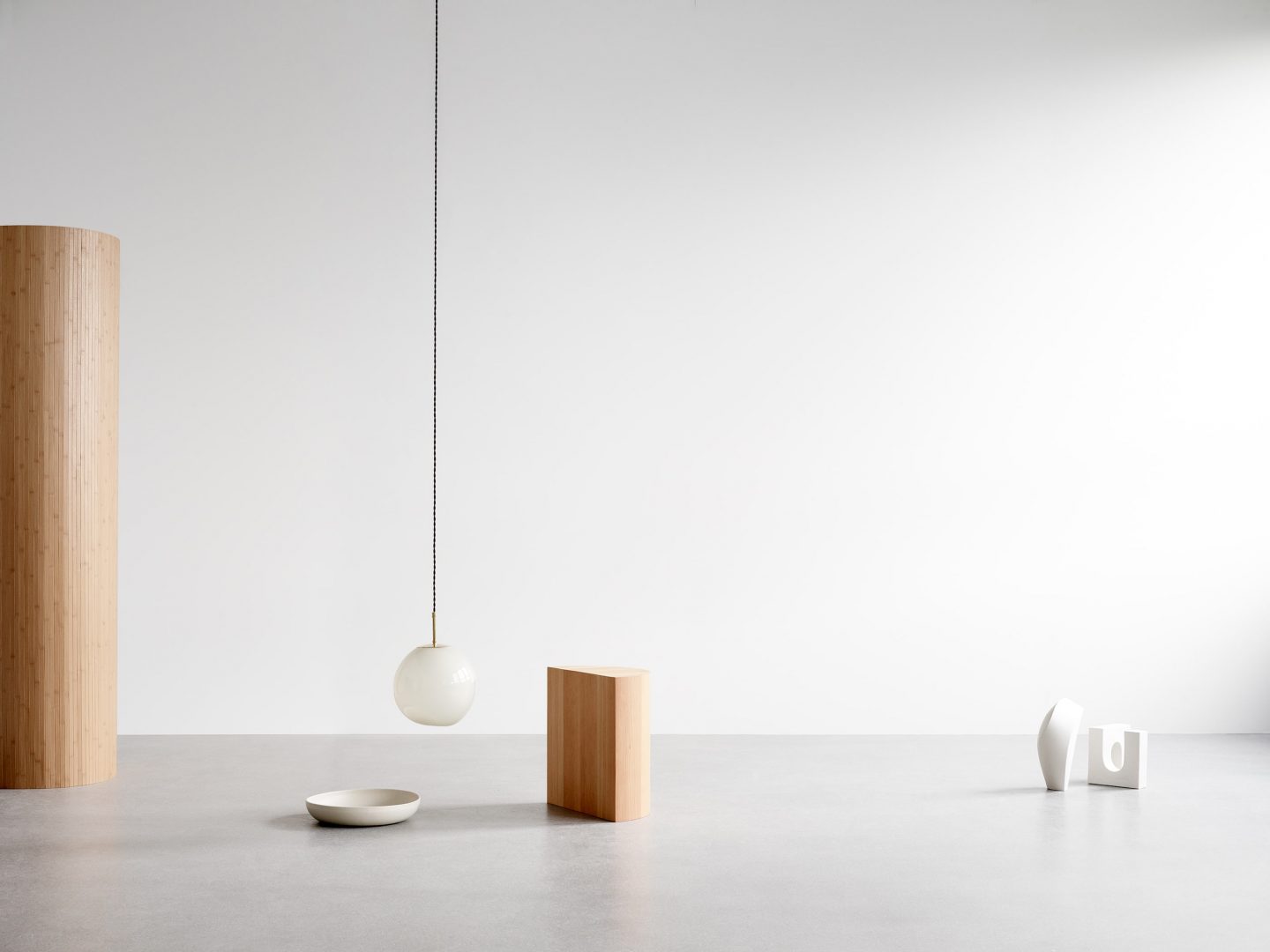
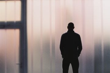
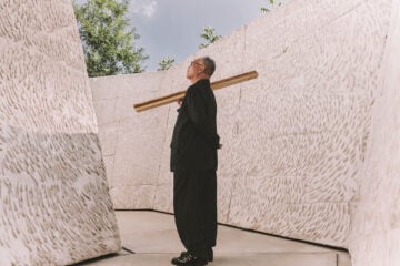
Image © Mikkel Mortensen
“I think during that struggle to find the right color there was a moment when I thought: I wish I could create my own series of colors,” she says. It wasn’t until four years later on a trip to Copenhagen that this idea reached fruition. “I walked into Studio Oliver Gustav two days after he had opened his new showroom—it was a very special experience, it was like I was transported somewhere else. His universe. A gray universe. The color of the walls was incredible and the texture was unlike anything I’d seen before.”
Michael inquired about it, and was told it was mineral paint: “I had no idea what that meant, but I couldn’t stop thinking about it. I did some research and discovered Keim [the world’s leading specialist in mineral paint] and that was how it all began.” Unlike conventional interior paints, mineral paints are free of synthetic binders, solvents and acrylics. They don’t give off toxic gasses and are naturally resistant to mould and fungal growth. Their unique composition renders them simultaneously matte and light reflective; a combination that gives the paint a luminous depth.
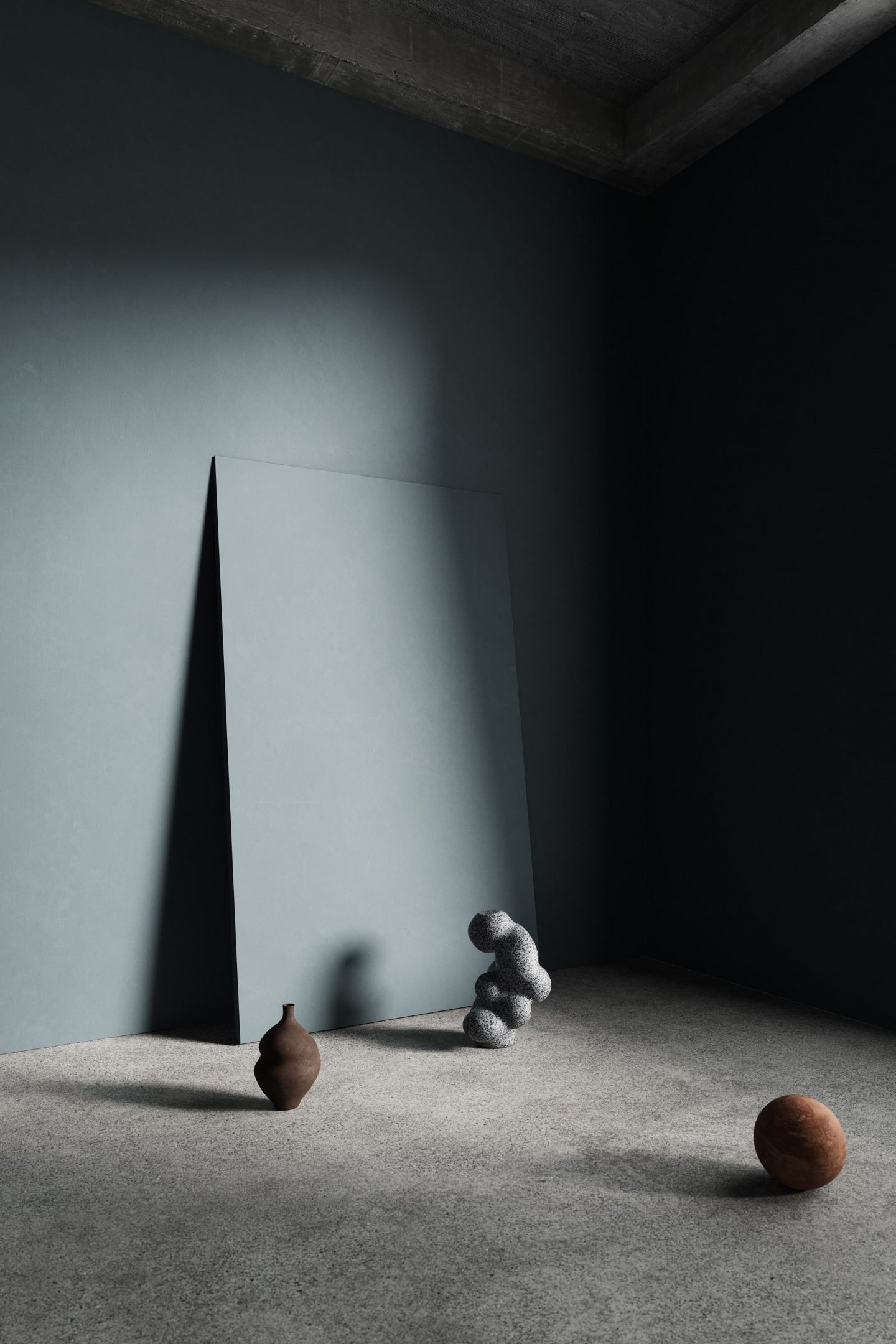
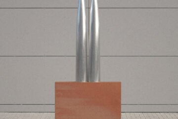
Visualization © Seen CGI
“Texture is everything,” Michael says. “Earth oxide pigments have a unique quality that allows total color stability. There is no deterioration by UV light, so the true color is always as you see it, without fading. There is also an opaqueness to mineral paint that gives it a unique texture which is almost dusty, yet rich and velvety.” There is, Michael insists, nothing quite like it. Working together with Keim, she has created three monochrome palettes for Gris: Nordic, Architectural and Inky. Each draws inspiration from her passions and travels, and each is replete with its own unique tone and timbre.
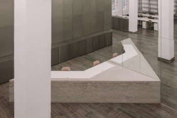
Visualization © Seen CGI
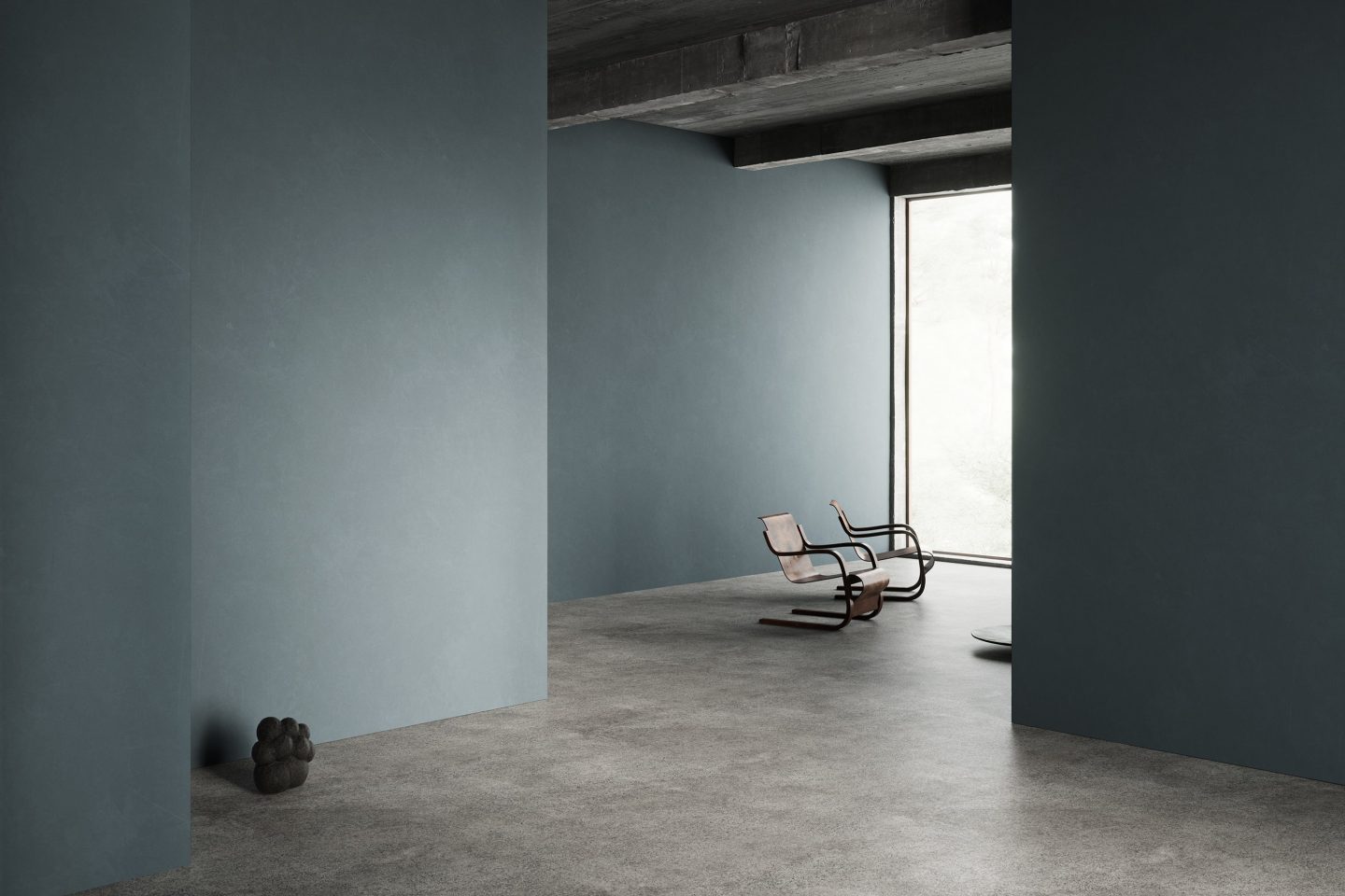
The Nordic series is inspired by the timelessness of Scandinavian design and the muted quality of light in cities like Copenhagen, which can appear in various shades of gray, white, and taupe. “You can feel the history of Danish design just walking the streets of Copenhagen,” she says. “There is something magical about the city that isn’t just light and shadows.” Michael has a special affinity with Copenhagen; it was here that she discovered mineral paint, and it is where she creates the campaign imagery for Gris with Danish interior stylist, Pernille Vest, who Michael describes as integral to capturing the aesthetic of Gris.
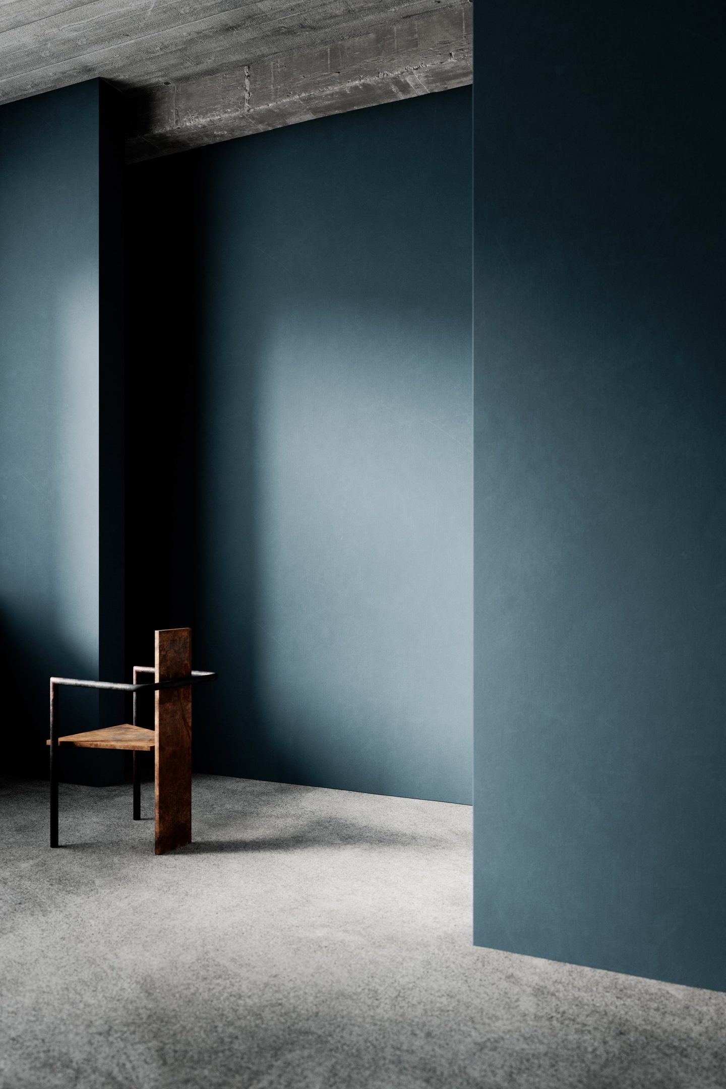
Where the Nordic series speaks of light, the Inky series draws upon the deep blues of Japanese inks and dyes, alongside the colors of old Japanese workwear and uniforms. With this collection Michael wanted to create a density in the colors, a “saturated feeling.” She explains: “I wanted very pigmented deep colors, but with tonalities that enliven and lift the darkness to create nuance, to avoid them becoming too flat and heavy.”
Visualization © Seen CGI
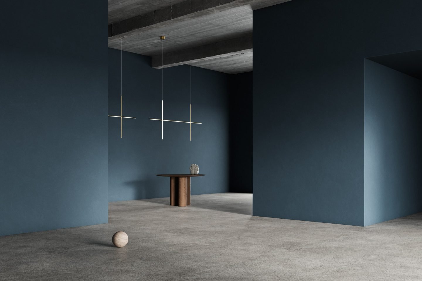
The Architectural series shifts away from inky to timeless, Modernist grays. The tonal range draws upon Michael’s passion for architecture, which began when she was introduced to the monumental work of Louis Kahn twenty years ago, and later blossomed into a love-affair with Brutalist buildings and the work of Modernists like Le Corbusier.
Michael also cites The Truth is Always Grey, a history of Modernist painting by Frances Guerin, as a source of inspiration for the Architectural series and her color concept as a whole. Most notably, its discussion of Gerhard Richter and the color gray: “Much has been written and debated about Gerhard Richter gray,” Guerin writes. “From the absence of color and reductiveness to the mixture of all colors, all grays together on one canvas. Like every aspect of Richter’s practice, gray is neither one dimensional nor straight forward.”
Visualization © Seen CGI
Michael is interested in the idea of contrast, repetition, and variation within color fields and the way that the smallest variation of tone can shift the feeling: “White, gray, blue. These are my color fields. I don’t have anything to say about other colors,” she says. This singular and specific approach to color has been further informed by the work of painters Daniel Levine and Quentin Morris; whose nuanced understanding of color can be seen in their monochromatic works.
“I looked at his [Levine’s] work for a long time,” she says, “and the study of his work enabled me to see white variations in a very different way.” Levine has been working in monochrome since the early 1990s, his paintings are layered and complex despite their alliterative appearance. Though they are all off-white compositions, no two paintings are the same color.
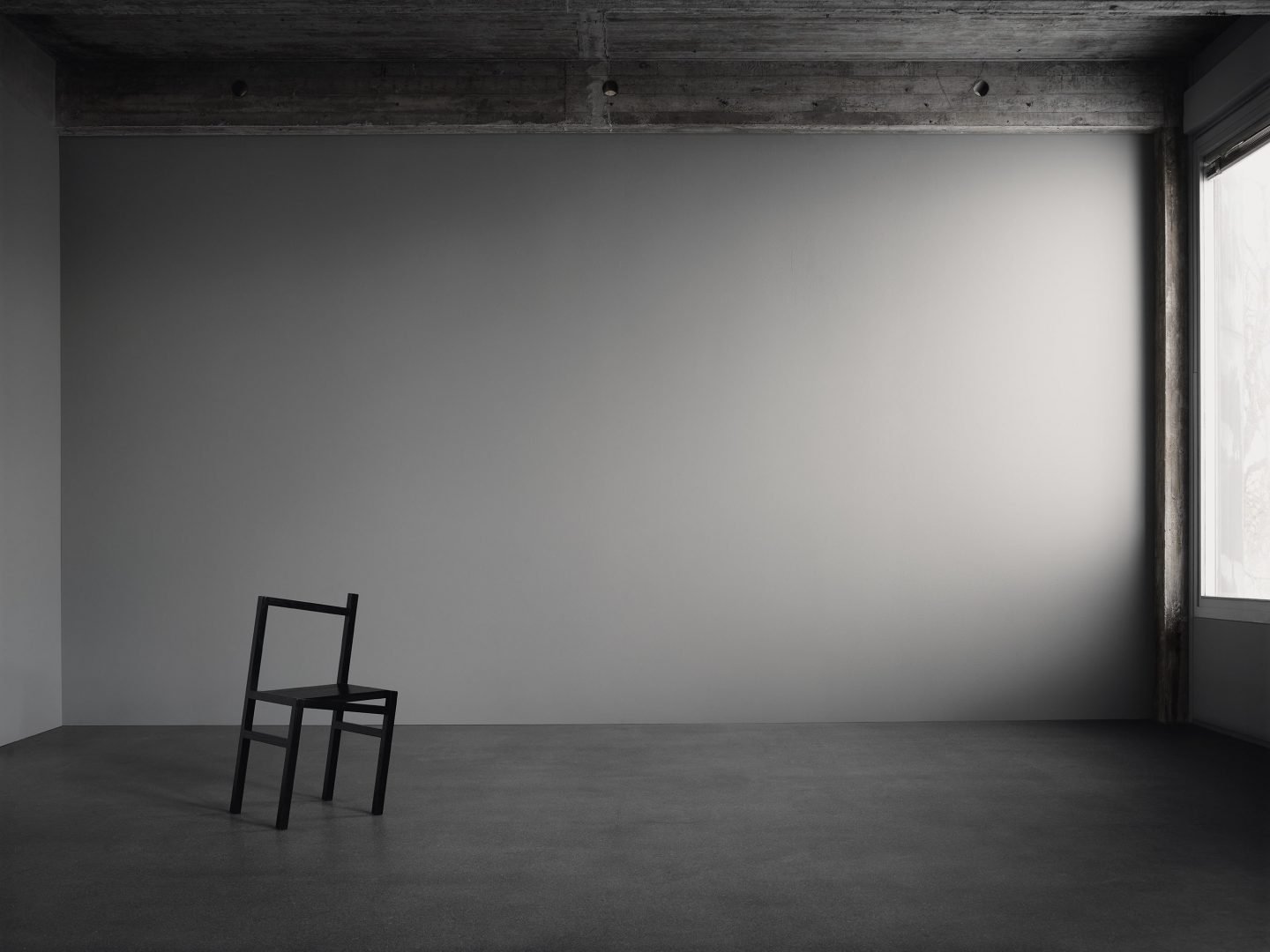
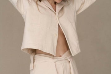
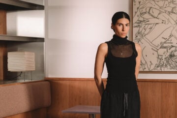
Image © Mikkel Mortensen
Paint is more than a surface covering. It is opacity, light, and texture.
Michael’s interest in Levine’s work can be seen in a color from the Nordic series, N.16: “I thought about N.16 for many months,” she says. “I asked myself, what did I want to say with a white? It should be not too white, not too bright, but subtle, luminous, the barest hint of cloudiness without it going gray. I thought it would be near impossible to achieve this level of subtlety. How could I do it? One day I got up and I just knew how to create it. On the second go, it was right.”
Like Levine, Michael understands that no color is singular. Even white—a color considered as colorless, that is so often equated to invisibility and absence—contains multitudes. Paint too, is more than a surface covering. It is opacity, light, and texture. It can convey complexity and depth in the sparest of ways. In conversation with Michael, Levine explained that his work existed outside of trends. Monochrome is, he said, “eternal and transcendental.” It follows then, that so too are the colors of Gris.
Produced and styled by Pernille Vest | Visualization © Seen CGI | Photography © Mikkel Mortensen | Words by Rosie Flanagan