A Tour Inside Bureau Borsche, Where Visual Identities Come To Life
- Name
- Bureau Borsche
- Words
- Devid Gualandris
Minimalism and simplicity are a surefire way to make brands distinctive, intriguing, cohesive, and instantly memorable; and no one knows this better than Bureau Borsche—the leading graphic design studio which has risen to the top by unlocking the right strategies and the potential of visual restraint.
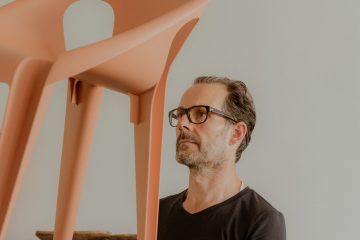
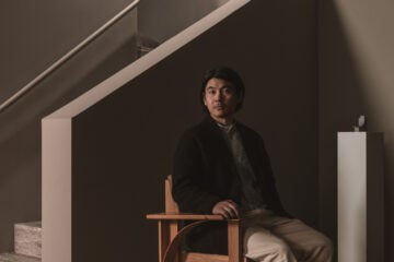
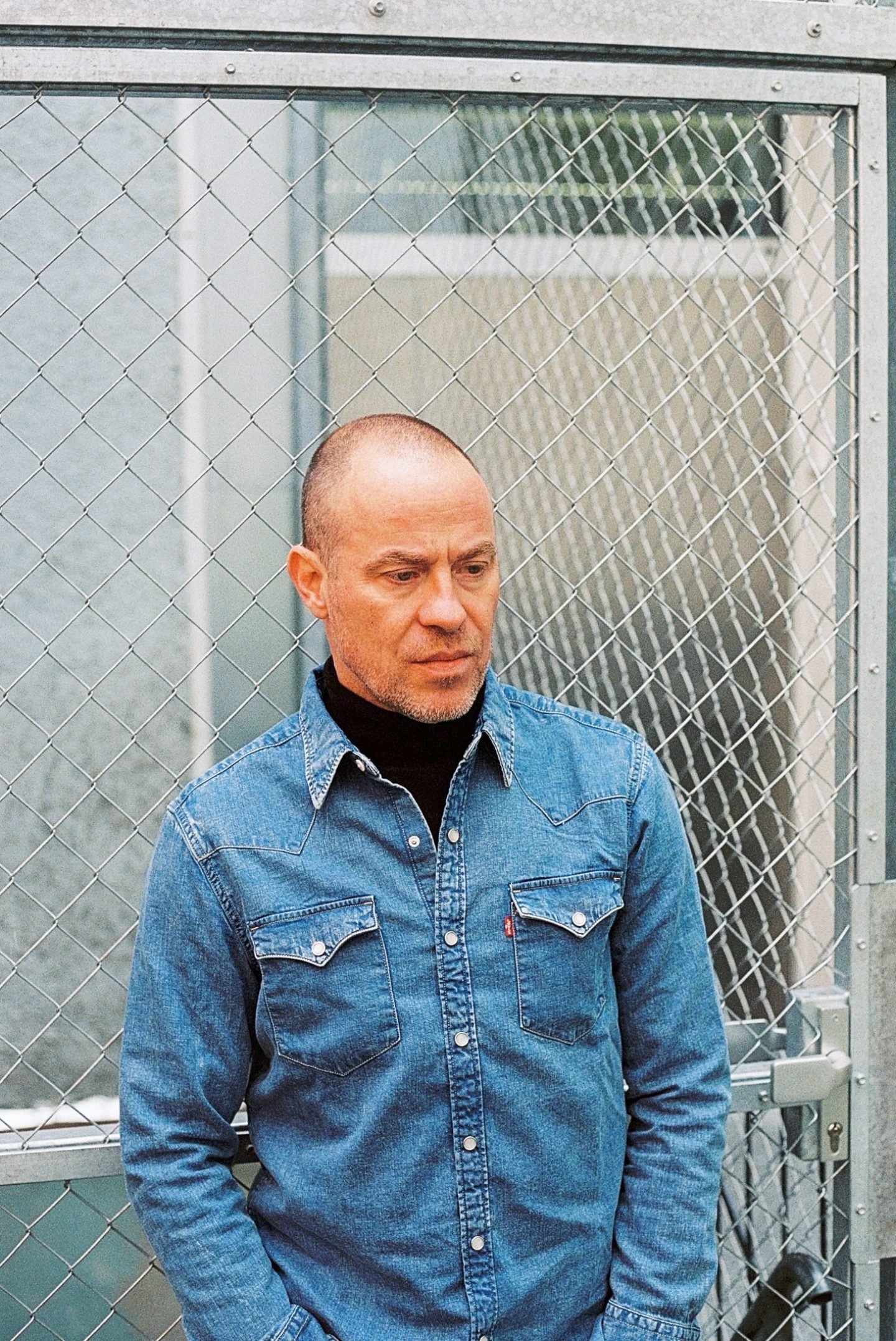
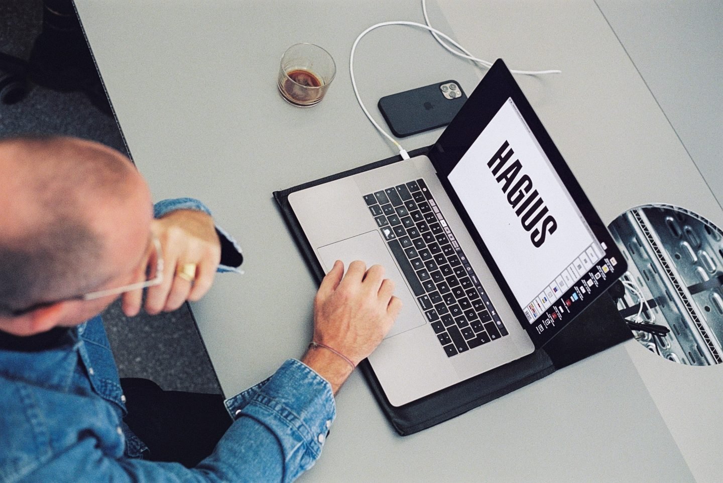
Combining the power of marketing and branding with a sophisticated visual language, the internationally active graphic design studio has achieved recognition as one of the most treasured studios in the industry. Sine 2017, Bureau Borsche has been offering design and communication consultancy to clients from all fields—from fashion superpowers Balenciaga, Supreme, Nike, and On-Running, to companies like Audi, BMW Group, and Apple; to cultural institutions like the Bavarian State Opera, and lifestyle spaces like Spazio Maiocchi in Milan, and luxury fitness studio Hagius in Berlin. Behind its creative versatility is founder Mirko Borsche, a graphic designer with a vision that stands out. In this studio visit in southern Germany, we talk to the creative director about the studio’s work ethos, and the secret behind their celebrated rebrandings.
Bureau Borsche has achieved recognition as one of the most treasured studios in the industry
From crafting his name as a graffiti artist in the late ‘80s and early ‘90s and studying graphic design at London’s Kingston University, to working for publishing houses and directing the award-winning German magazine Die Zeit Magazine, Borsche’s journey has been the natural evolution of a young creative with a unique drive to explore culture and design. “In 2017, I wanted to start freelancing,” he explains, “so I set up my website and called it Bureau Mirko Borsche. Not long after, the Bavarian State Opera asked to cooperate—that’s when the idea of having a design studio really came along.”
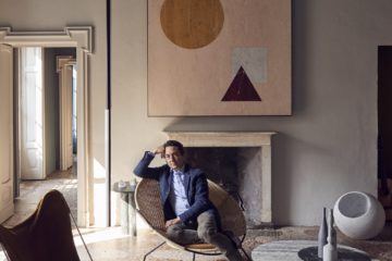
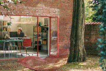
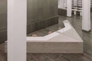
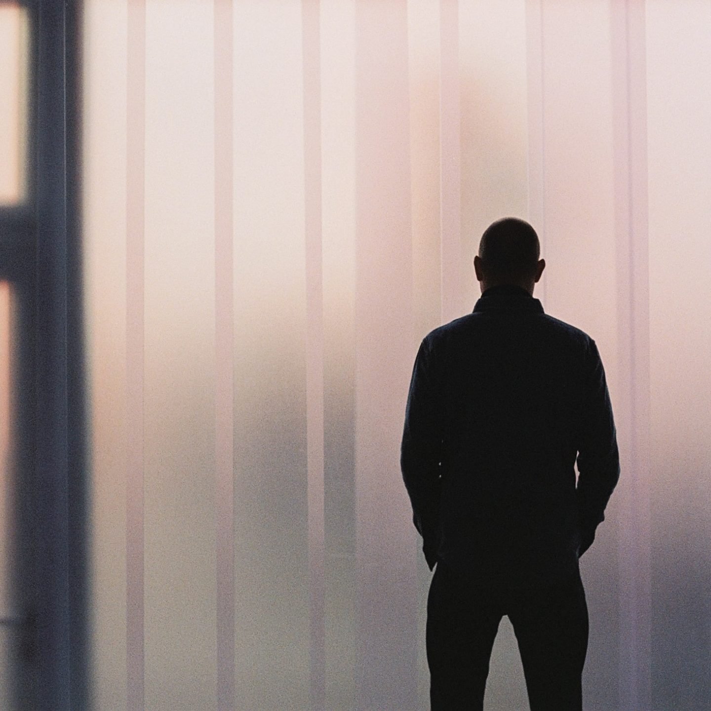
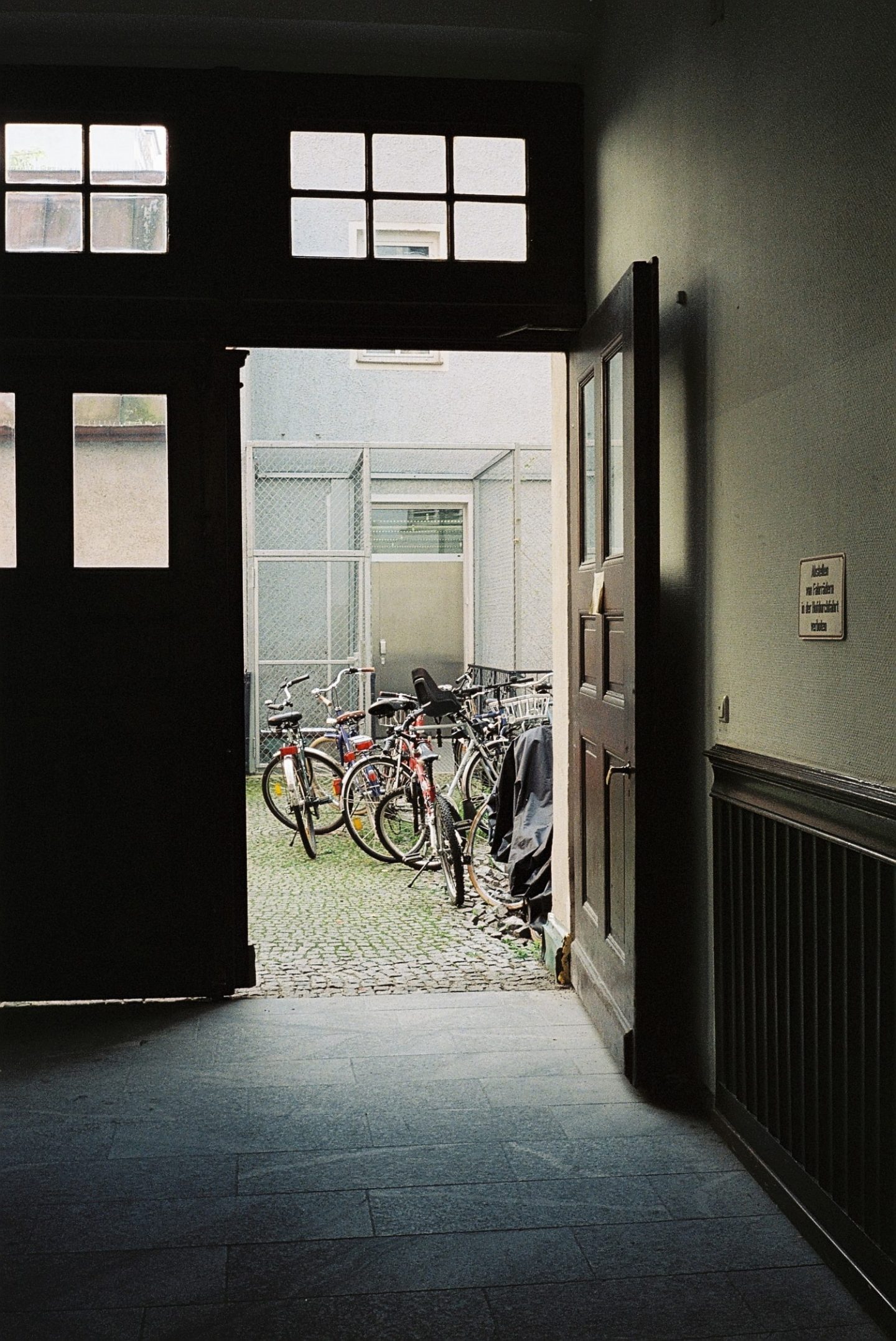
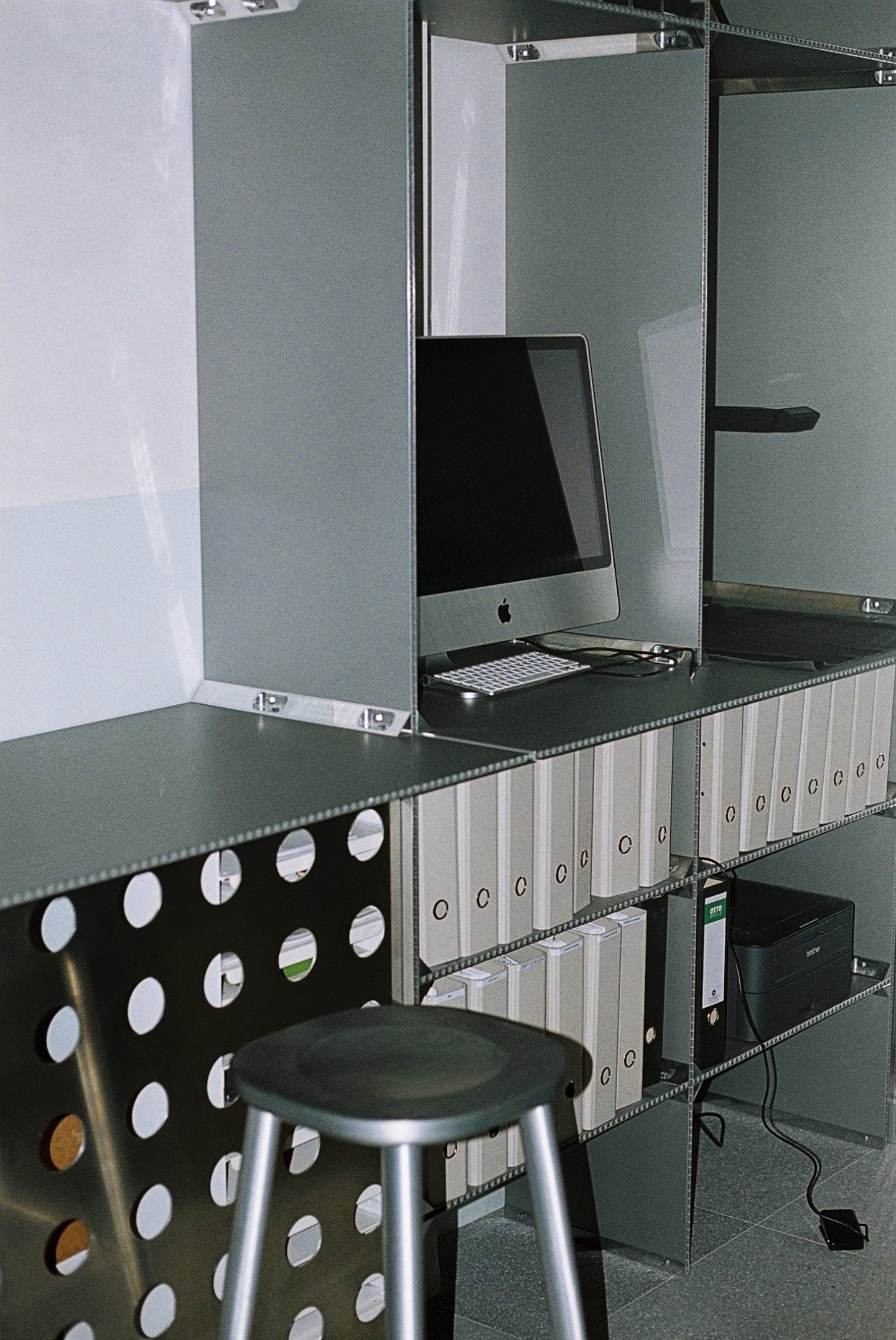
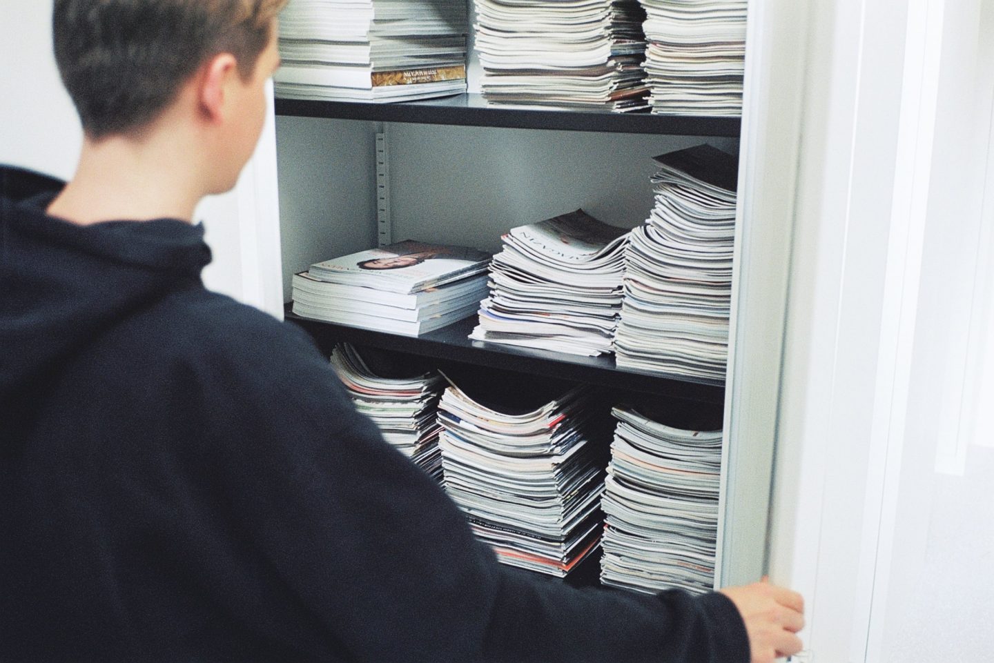
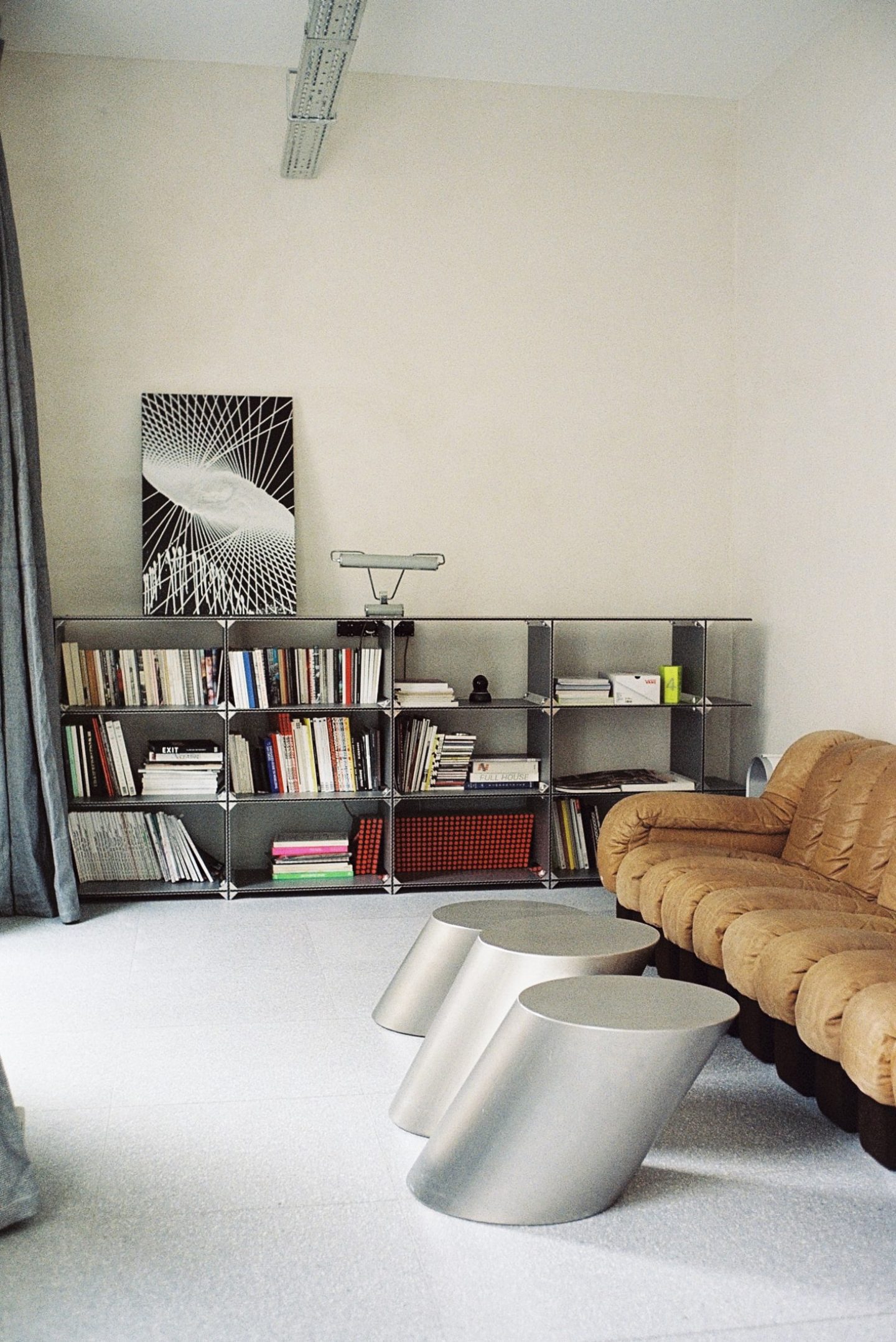
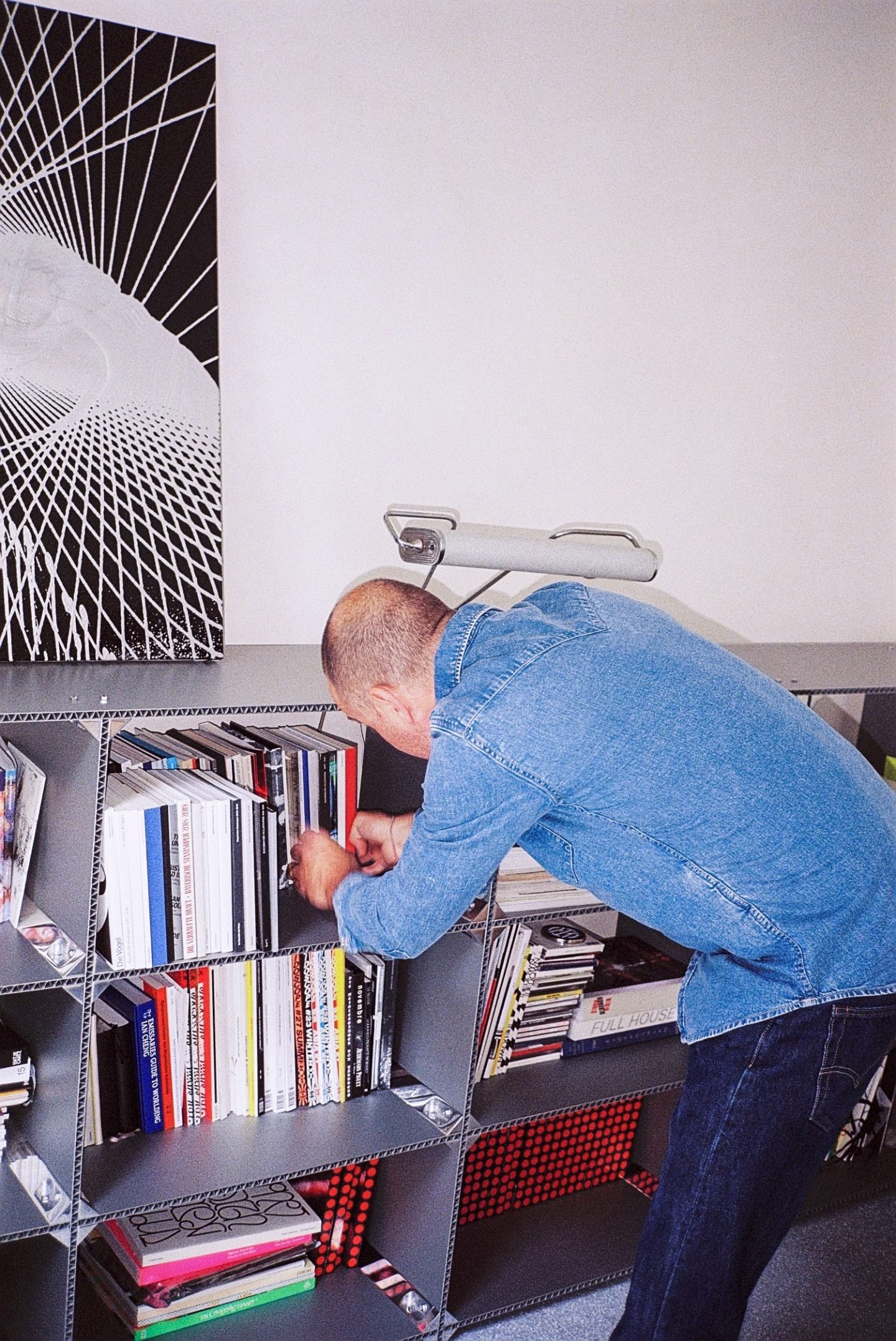
We chat with Borsche from his new office in Munich. Located in close proximity to the Central Station in what was formerly a kebab restaurant, the place is immediately striking for its uncommon location. “We moved in on the first day of the COVID-19 lockdown. Now, we are finally starting to feel the area,” he shares as he walks us through the space. With a 300-square meter interior, the office is an upgrade from its previous location: an unostentatious city loft, just half the size. Featuring a showroom, a work area, and a lounge, the space is the collaborative work of Berlin-based architecture firm Gonzalez Haase AAS, German designer Stefan Diez, and furniture manufacturer Wagner Living.
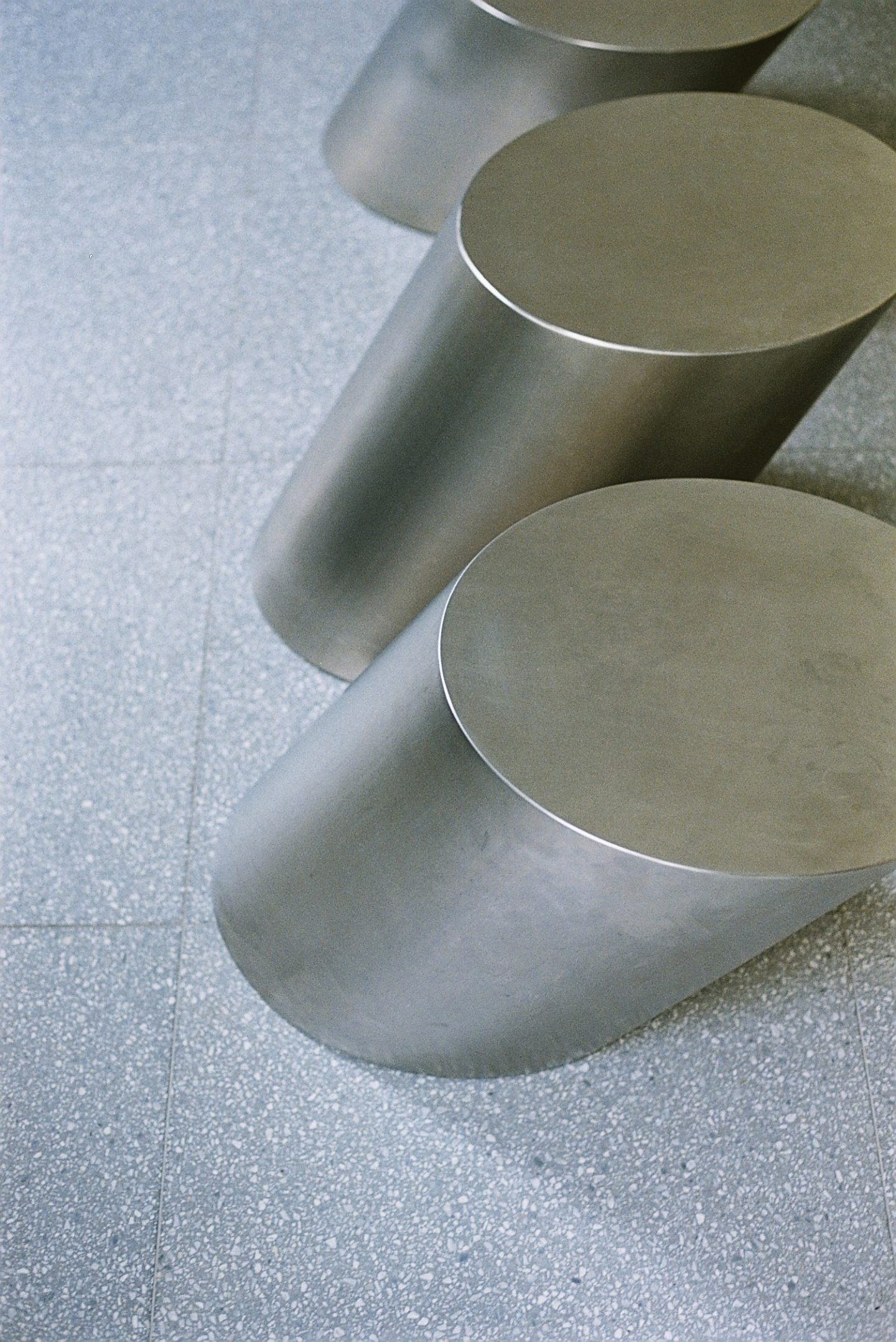
Inside, the mostly monochromatic interior and the industrial raw aesthetic exist in stark contrast to the quintessential German Altbau-style exterior facade. Though columns, grinders, and brick walls are still noticeable, the structure has been painted white, with flooring redone with concrete slabs in a terrazzo look, which is also used for the wall panels. “[The slabs] are a reference to the Sendlinger Tor subway station in Munich, which is tiled with the same material,” notes Borsche.
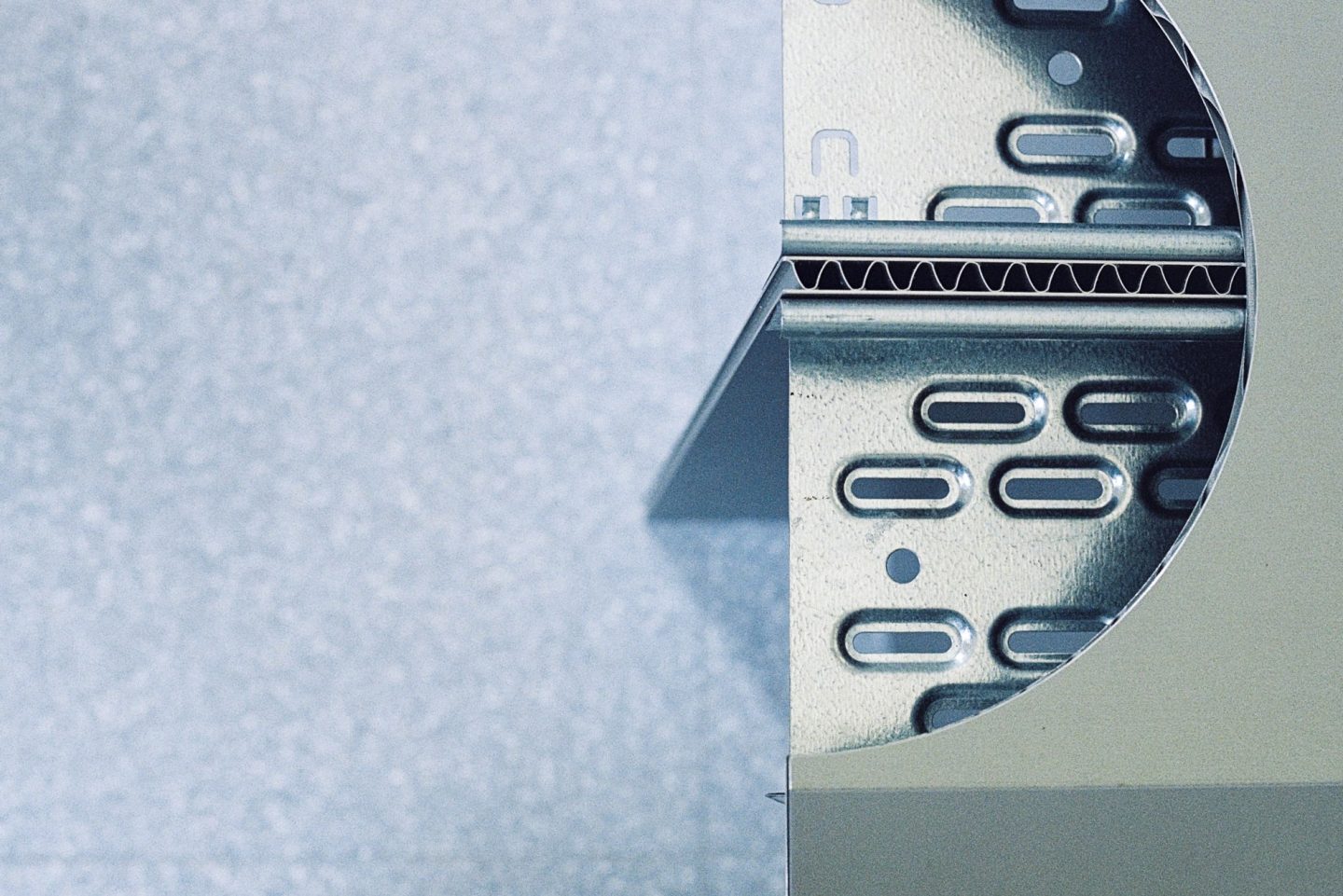
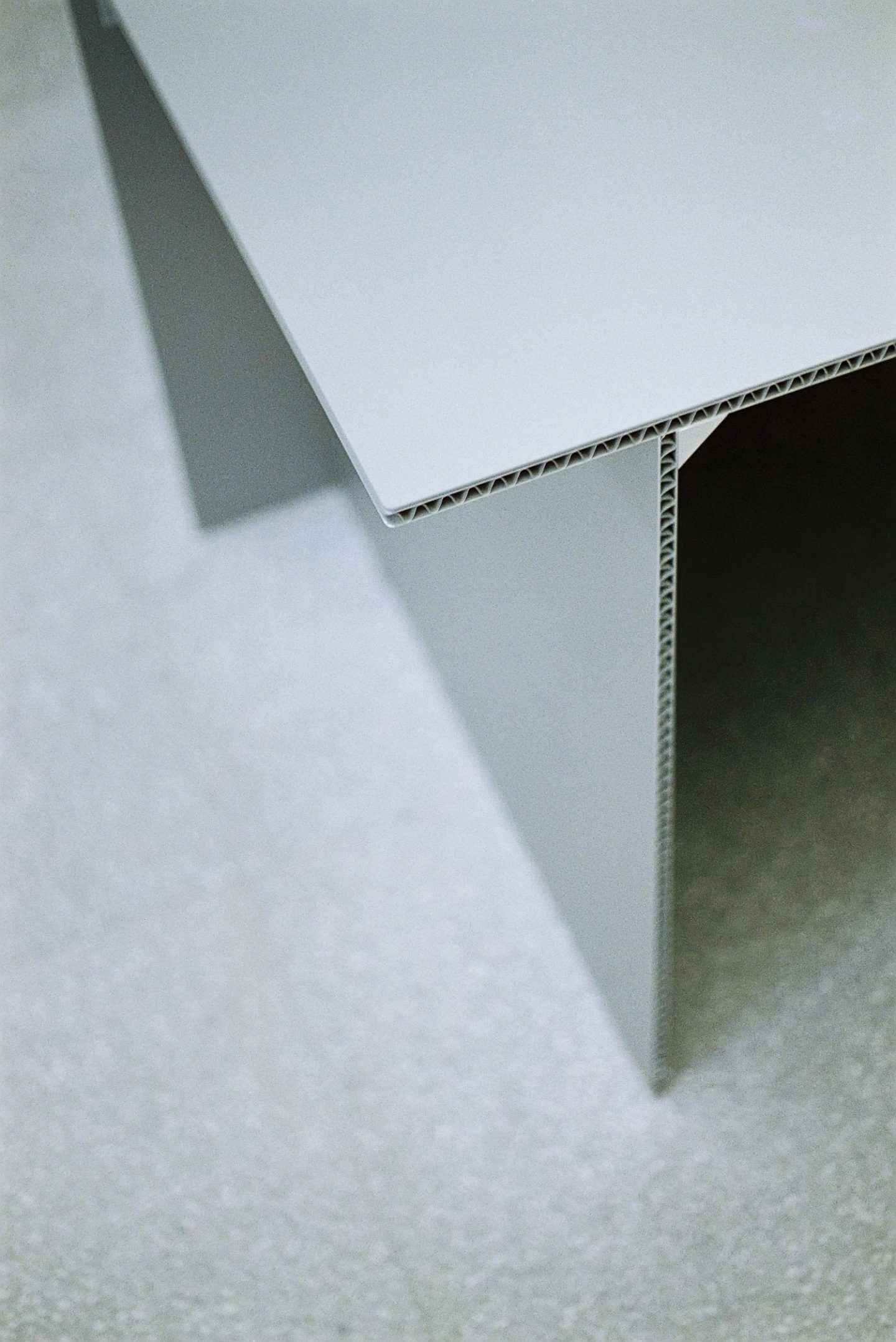
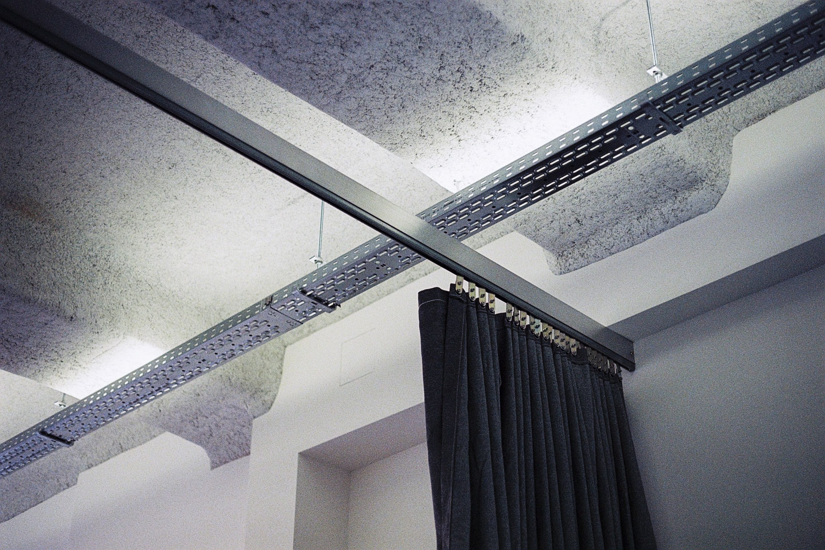
“The office serves as a laboratory and showroom,” he continues. It is “open-plan and flexible, as it had to meet requirements of adaptability and individuality.” An innovative furniture system titled ‘D2’, developed on-site by Wagner Living and Gonzales Haasee, structures the space, offering modular solutions for the studio’s changing purposes. With open-edged shelves and room dividers assembled from aluminum profiles and honeycomb panels, it blurs the rooms’ boundaries, giving the office a unique character and an almost futuristic look.
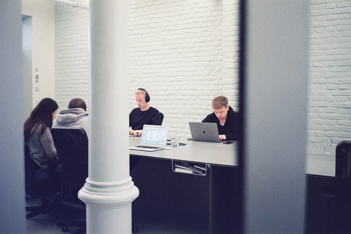
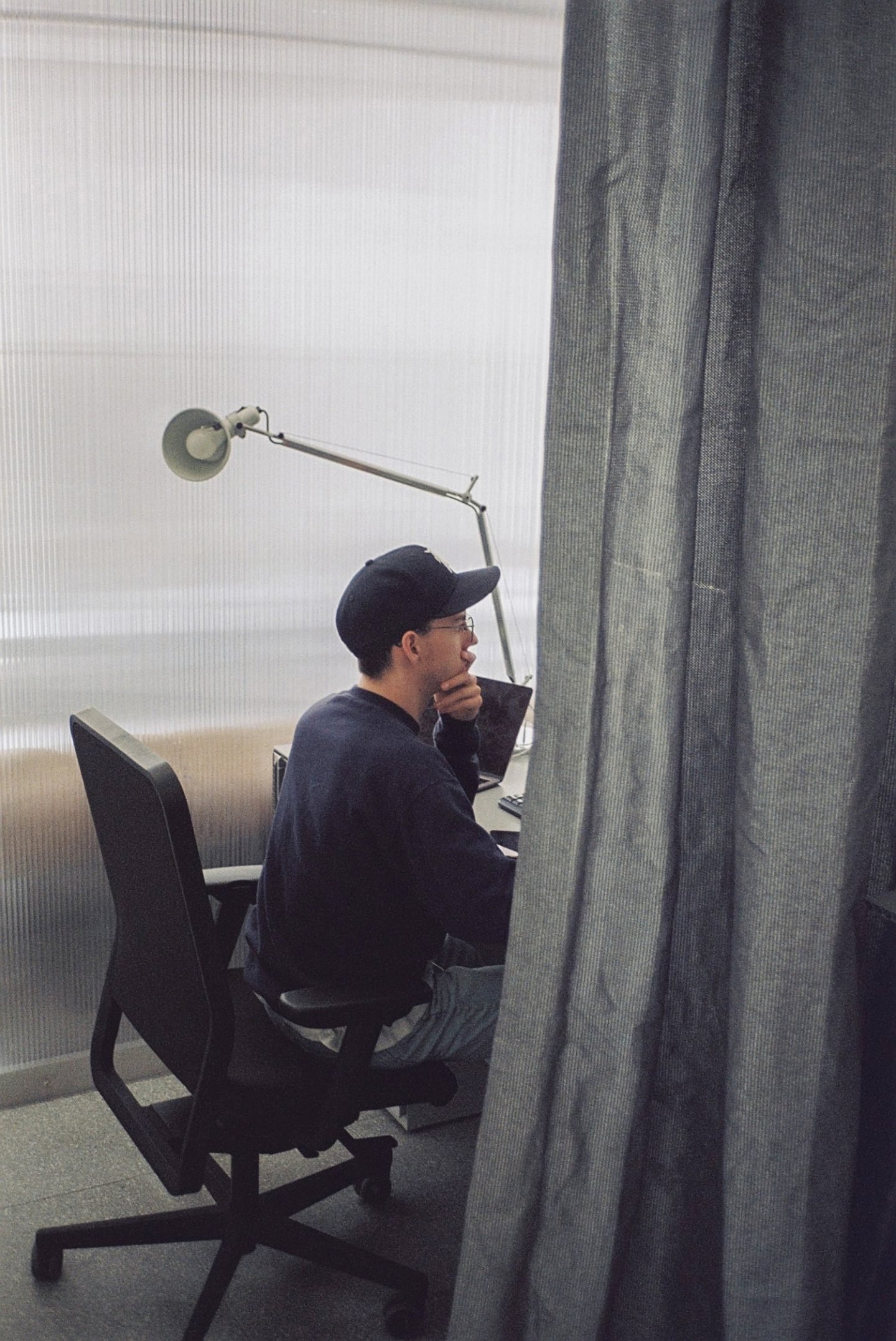
Despite the company’s success and physical growth over the last years, Borsche still looks at it as a small studio: “an intimate place based on genuinity and exchange of experience,” he says. His team—a fixed staff of five graphic designers, a studio manager, two interns, plus visiting freelancers—all work on the nine-meter-long aluminum table dominating the common room. Above them, LED light solutions reminiscent of those found in a gallery, create a sense of calmness with their gentle glow. The synergetic setting is meant to reflect the gist of the company; namely networking, collaborating, and establishing ideas between people. “We try to work in a lot of creative fields,” the founder explains about their work ethos; “so we strive for a good balance between art direction, design, and creating our own projects.” Today, much of his work involves guiding concepts and strategies, yet the designer is tightly intertwined with productions.
"We strive for a good balance between art direction, design, and creating our own projects"
Throughout the years, Borsche’s captivating design work has earned him a reputation as something of a provocateur. “Funnily enough, I am not concerned with the instrumentality of deliberate provocation. We don’t try to spark any interest. All we do is try to help our clients stand out,” he says. Yet what does standing out entail? For Borsche, it is not always about the new and unseen, but about finding ways to elevate the client and engage an audience with the brand.
“Oftentimes, it is less about what you can add to an existing design, but what you can take away,” he shares. In recent years, the move from complex imagery towards minimalist logos has been evermore so noticeable. A simple logo can cut through the noise, increase recognizability, and achieve timelessness. Like many other studios, Bureau Borsche has revamped websites and logos for their clients, favoring simpler, more symbolic and unitized visual identities. “Together with [Balenciaga creative consultant] Gian Gisiger we created a new, simple, and timeless identity as a contemporary vision of their previous classic one,” Borsche explains. He is speaking about their 2017 update of the fashion house’s logo with a taller, more slender typeface. Despite its modernization, time, heritage, and zeitgeist still informed the design direction. “The initial inspiration for the new design was the signage in a Paris metro station—an alternative version of the Univers drawn by Adrian Frutiger—which we adapted to create a crisp new face,” he continues.
The shift to simplified logo has received criticism for its danger of becoming devoid of personality. Yet Borsche has reiterated that a minimalist look does not reduce the value of the brand’s storytelling. “The same applies to [luggage manufacturer] Rimowa,” he remarks. In 2018, the company announced a new visual identity for its 120th anniversary with a thin, sans serif font that replaced the iconic logo created in the 1980s. “For centuries, the brand has stood as the prototype for German quality and design. We did not simply modernize its typeface, but we instead created a reinterpretation of the Akzidenz Grotesk—which marked the beginning of modern typefaces, and was first presented in Berlin in 1898—the same year Rimowa was founded.” Borsche assures us that storytelling “is not dead”—logos may just be returning to a more symbolic state, as just one piece of the story.
For Borsche, a minimalist look does not reduce the value of the brand’s storytelling

Symbolic or not, in today’s connected era, logos have become more important than ever. One of the studio’s recent projects has been the rebranding of the Football Club Internazionale Milan, commonly known as Inter, in an effort to promote it as a contemporary global brand. “Football clubs are now more active, beyond the pitch and the world of football itself,” says Borsche, so “it is important to adapt and establish a competitive identity.” The studio refreshed the club’s logo with a new crest devoid of gold accents, and featuring a simplified monogram of the iconic letters I and M framed by the classic concentric circles. “Working on the crest was the most challenging part of the process,” the designer admits; “for every football club, it is the holy grail adored by millions of fans around the world.” Bureau Borsche also updated the saturation, replacing the original pantone defined by Giorgio Muggiani in 1908 with a more vibrant azure, which is more noticeable on mobile devices. “We wanted to create a look that would be accessible, sophisticated, relatable, and strong,” he explains.
"Brandings must work digitally in all formats and sizes"
As our visit takes us to the so-called “project room” on the ground floor—a showroom where exhibitions, workshops, and pop-ups are to take place in the future—Borsche annotates how, beyond being easy to process, minimalist logos can easily fit a variety of mediums and screens, whether responsive websites, social media, or apps. “A logo must be scalable; whether you enlarge it or zoom it out, details must not get lost,” he says. Consistent branding is, after all, the need of the hour. “These days, brandings must work digitally in all formats and sizes, and [a logo] needs to be visible and understandable in different regions all over the world,” he continues, adding that COVID gave that extra push—“Suddenly, a lot of brands understood the need of investing into e-commerce and using digital platforms to promote their product.”
The way we consume content has indeed changed—our attention span is getting shorter by the year, company-customer interactions are briefer, and consideration is given less to factors like heritage and more to what the product can bring. This creates new challenges for designers. Although there are no rules or steps to follow, for Borsche, the best way to go about it is to maintain the essence of the brand while aiming for simplicity, for it gives confidence, authenticity, and a certain solidity. As we leave the pared-back space with the feeling that the more we subtract, the more we are left with, we cannot help but wonder: Does simplicity always win the game?
Images © Max Wittrock for IGNANT production